Actions
Bug #77928
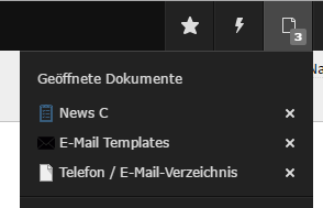
closedUse non-dark background in "opendocs" dropdown
Status:
Closed
Priority:
Should have
Assignee:
-
Category:
Backend User Interface
Target version:
-
Start date:
2016-09-13
Due date:
% Done:
0%
Estimated time:
TYPO3 Version:
8
PHP Version:
Tags:
Complexity:
Is Regression:
No
Sprint Focus:
Description
Hi there,
the icons of pages and content elements are always visible on light / gray backgrounds, except the "opendocs" dropdown (see attached screenshot).
It would be more beautiful if there is also a non-dark background. What do you think?
Regards,
Markus

Files
 Updated by Riccardo De Contardi about 8 years ago
- Category set to Backend User Interface
 Updated by Daniel Goerz about 8 years ago
- Description updated (diff)
- Status changed from New to Needs Feedback
The "opendocs" dropdown has now a slightly brighter background. Do you consider this issue solved with the current situation?
 Updated by Markus Hölzle about 8 years ago
- Status changed from Needs Feedback to Resolved
Looks better, thanks a lot! Great UI :-)
Actions