Bug #90824
closedAdd media file - too many options? Confusing ...
0%
Description
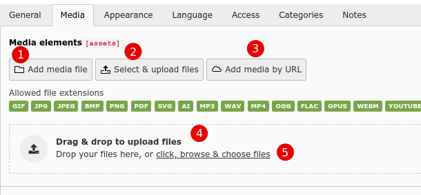
For example in the "textmedia" element "media" tab I have 5 options:
- Add media file
- Select & upload files
- Add media by URL
- Drag and drop to upload files
- or "click, browse and choose files"
While it is cool that you can do several things, there is some overlap.

Option 1 is kind of a mega-dialog where you can also upload files and also use an URL. Why have 2 and 3 if you can already do that in 1?
Option 5 is basically the same as 2.
There may be a reason for doing it this way but it is not immediately intuitively understandable for me.
Once you do click on one of the options, the workflow is pretty simple.
Also the phrasing:
- in option 1 it is "upload media file"
- in option 2 it is just "select & upload files"
In all these cases it is a media file, so I would always use "media file" or just "file". Otherwise you look at the buttons and wonder what is the difference.
Files
 Updated by Susanne Moog over 4 years ago
- Status changed from New to Needs Feedback
- The drop zone is used to signal the user that she may use drag and drop to upload files - and it only appears once you start dragging stuff (so it's not even displayed when it's not useful)
- Select & Upload files is a shortcut to be able to directly upload without the need to select a folder first
- Add media file is mainly used to add images you want to reuse / add in a specific folder / select existing ones
- Add media by URL does something completely different
Depending on the instance you can configure which buttons to show for your editors and your use cases. I don't quite see a problem here. The plural of the first button could be changed, yes.
To me, the only thing about the buttons would be: if we'd display the drop zone anytime, we could remove button no 2 - however I would only change that when adding a new drop zone implementation which can do more (for example paste images and upload folders - there's a ticket for that :)).
 Updated by Sybille Peters over 4 years ago
Thanks for the clarifications. That is very helpful.
It's weird. I had the "drop zone" displayed without dragging anything. Cannot reproduce this now on my test systems.
I also found this on Stack Overflow:
File uploads are only possible when the user has access to the folder user_upload. If you restrict the access for the user one can't see the "Select & upload files" any more
I will close this issue.
I also created an issue for documentation: https://github.com/TYPO3-Documentation/TYPO3CMS-Reference-CoreApi/issues/814
 Updated by Sybille Peters over 4 years ago
- Status changed from Needs Feedback to Closed