


Feature #32450
closed
Improve usability of the toolbar (displaying the username)
100%
Description
Move dispensable information into the background.
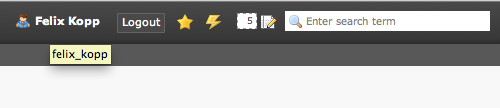
The username should not be always visible - users know the username because they logged in with their credentials. Furthermore the username can be pulled from the link title by holding the mouse cursor on the link.
+source code optimization
Files
 Updated by Gerrit Code Review over 12 years ago
Patch set 1 for branch master has been pushed to the review server.
It is available at http://review.typo3.org/7209
 Updated by Georg Ringer over 12 years ago
i want to have a info from design/ui/hci team if this change is approved
 Updated by Steffen Ritter over 12 years ago
Georg Ringer wrote:
i want to have a info from design/ui/hci team if this change is approved
yes, dito - I do not see a need for this...
Updated by Steffen Ritter over 12 years ago
- Target version changed from 4.7.0-alpha2 to 4.7.0-alpha3
 Updated by Chris topher over 12 years ago
- Subject changed from Toolbar username unclutter to Improve usability of the toolbar (displaying the username)
Updated by Chris topher over 12 years ago
- Tracker changed from Task to Feature
- Project changed from TYPO3 Core to 78
- Category deleted (
Backend User Interface) - Target version deleted (
4.7.0-alpha3)
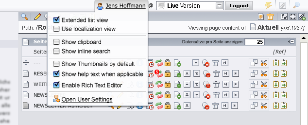
 Updated by Jens Hoffmann over 12 years ago
- File UserSetting1.png UserSetting1.png added
- Category set to Usability
- Status changed from New to Accepted
- Assignee set to Jens Hoffmann
- Target version set to TYPO3 4.7
Looks fine to me. +1
The original Design never had the (user name) info in there.
- Real Name @ Workspace [Logout]
- Klick on user show a context Menu
- In there we could show geek values,
like the technical username.
See (TYPO3 v4.1 .. hehe):
Updated by Chris topher over 12 years ago
- Project changed from 78 to TYPO3 Core
- Category deleted (
Usability) - Target version deleted (
TYPO3 4.7)
Updated by Chris topher over 12 years ago
- Category set to Backend User Interface
- Assignee deleted (
Jens Hoffmann) - Target version set to 4.7.0-alpha3
- TYPO3 Version set to 4.7
Jens Hoffmann wrote:
Looks fine to me. +1
Perfect!
 Updated by Steffen Gebert over 12 years ago
I still think the user name is not uninteresting.. There could be more users with the same real name, while username is unique. At least as tooltip I would prefer to show it.
Updated by Jens Hoffmann over 12 years ago
Why not - Tooltip never hurts :)
@Christopher: Why is this issue again in Core?!
As this is not Technical .. open up a additional
Ticket and Link the two tickets.
Give the people a change to reply ... +1 != +3 ...
 Updated by Felix Kopp over 12 years ago
Yes, the username was moved to the title-attribute on the full name.
(Please also consider ringer's feedback at https://review.typo3.org/#change,7209)
Updated by Felix Kopp over 12 years ago
How shall we handle the SU case:
With or without the username and what shall the title be?
 Updated by Ingo Renner over 12 years ago
When SUing I'd still like to see the user name as in those cases it seems to be an important information. Also in that case it can actually happen that users with the same or similar (real) name exist...
Updated by Felix Kopp over 12 years ago
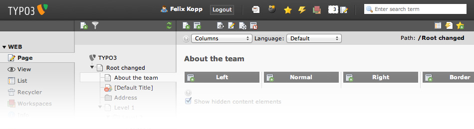
- File TYPO3-Backend-NORMAL.jpg TYPO3-Backend-NORMAL.jpg added
- File TYPO3-Backend-OPEN.jpg TYPO3-Backend-OPEN.jpg added
What about putting the username not into the title-attribute but a real fold-out?
(inspired by preview.typo3.org)
Furthermore the modules from USER TOOLS could be moved into the new fold-out. These tools are used less frequently.
 Updated by Fabien Udriot over 12 years ago
TYPO3-Backend-NORMAL
TYPO3-Backend-OPEN

Updated by Felix Kopp over 12 years ago
Shall we move the username to the right?
Shall the logout button be moved to the fly-out menu or shall there still be a logout button in the toolbar right of the user's name?
What do you think?

Updated by Felix Kopp over 12 years ago
SU case
Updated by Ingo Renner over 12 years ago
I'd prefer to keep the order like it is now, the search field looks quite misaligned when not on the right
Updated by Felix Kopp over 12 years ago
- File CURRENT-realname.png CURRENT-realname.png added
- File CURRENT-no-realname.png CURRENT-no-realname.png added
- File SU-realname.png SU-realname.png added
- File SU-no-realname.png SU-no-realname.png added
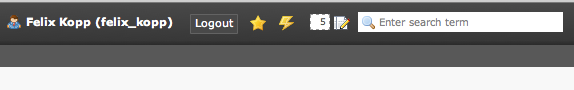
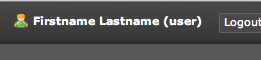
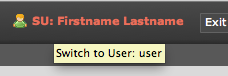
Sure, only focus on username - nothing else:
Current user - realname availiable
Current user - no realname
SU user - realname availiable
SU user - no realname
Updated by Gerrit Code Review over 12 years ago
- Status changed from Accepted to Under Review
Patch set 2 for branch master has been pushed to the review server.
It is available at http://review.typo3.org/7209
Updated by Gerrit Code Review over 12 years ago
Patch set 3 for branch master has been pushed to the review server.
It is available at http://review.typo3.org/7209
Updated by Felix Kopp over 12 years ago
Anything new?
Just a friendly reminder :)
Updated by Felix Kopp over 12 years ago
Are there any new thoughts on this idea?
 Updated by Ernesto Baschny over 12 years ago
- Project changed from TYPO3 Core to 78
- Category deleted (
Backend User Interface) - Target version deleted (
4.7.0-alpha3)
There still needs to be a usability team decision upon the "SU" case ("Switch User").
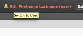
Updated by Ernesto Baschny over 12 years ago
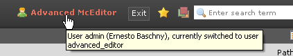
- File SU-tooltip-baschny.png SU-tooltip-baschny.png added
I like the last suggestion from Felix, but:
In my (humble) opinion the two letters "SU" have no meaning to most users I deal with (even admins), only for the Unix affixionados.
So my suggestion is to just get rid of those letters and instead move the information about the "switched user" status to the tooltip, and only show the Username in "red" denoting that "somethings different":
Jens, what do you think?
Updated by Ernesto Baschny over 12 years ago
- File SU-realname-baschny.png SU-realname-baschny.png added
Sorry, I meant this:
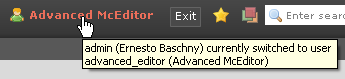
Always show "username (Real Name)" in the tooltip if the information about the real name is available, else show only the respective "username".
Updated by Jens Hoffmann over 12 years ago
- Category set to Usability
- Status changed from Under Review to Needs Feedback
- Assignee set to Jens Hoffmann
- Priority changed from Should have to Could have
- Target version set to TYPO3 4.7
In general I like the Idea of improving the Header. :)
Big thanks to Felix for all the work on this topic!
Space
I like the idea of more hight for the menu, looks quite
valuable to me. And the clear/visuell Separation is a
nice help, too. We should go for that.
Logout
The idea of putting the logout into the user context
menu is nice to clear up the top menu. As most users
just close the browser and auto-timeout there sessions.
Arrangement
But, we should the arrange the object in the top menu
(by default, maybe this is configurable) by usage of a
average-user, not a power-user like we all here are!
A average-user will search a lot more than to review
his user-settings. So for the top right should stay, the
search as most used thing.
It looks ok (at your Screenshot) to have the search on
the left, but with a normal view with a tree below and
the filters visible, it will messes up the thing a lot. :(
So I would still suggest to go for: (From Left to Right)
- TYPO3 Logo
- (Dynamic space)
- Custom Widgets (By Extensions)
- System Widgets
- | .. separater
- User (& Settings or Switch etc.)
- Search Field
Switch User
Maybe we need to come up with a complete new solution.
It should explain in more detail what's going on. I think we
need to show more Informations about it.
- Real user (the one who really logged in - and we will switch back to).
- Switched user (with which role (or group) .. admin/editor ..)
Show Name
To me it would be fine to go for a more friendly way of communication:
" Hello Felix "
And only on rollover or in the context menu, it shows tech details, eg:
- Username: feKopp
- Realname: Felix Kopp
- Role/Group: admin
Greez Jens
Updated by Ernesto Baschny over 12 years ago
Hi Jens, please allow me to give my layman's comments:
Jens Hoffmann wrote:
Space
I like the idea of more hight for the menu, looks quite
valuable to me. And the clear/visuell Separation is a
nice help, too. We should go for that.
Which "more height" do you mean? I have not seen this being mentioned before (at least in this issue).
Logout
The idea of putting the logout into the user context
menu is nice to clear up the top menu. As most users
just close the browser and auto-timeout there sessions.
The Logout has always been to the right of the "Username". The button changes to "Exit" if the user is switched to another user (to "Exit" the "switched user" state).
Arrangement
But, we should the arrange the object in the top menu
(by default, maybe this is configurable) by usage of a
average-user, not a power-user like we all here are!
A average-user will search a lot more than to review
his user-settings. So for the top right should stay, the
search as most used thing.It looks ok (at your Screenshot) to have the search on
the left, but with a normal view with a tree below and
the filters visible, it will messes up the thing a lot. :(So I would still suggest to go for: (From Left to Right)
- TYPO3 Logo
- (Dynamic space)
- Custom Widgets (By Extensions)
- System Widgets
- | .. separater
- User (& Settings or Switch etc.)
- Search Field
Think about the position of the icons if we display the "Username" right before the search box: Their position will vary depending on who is logged in. Imagine user with a long name, the icons will get shifted way to the left.
I like the current ordering, as the most important stuff that is positioned on the top-right starts from the far-right and is finished by the most dynamic part (the name of the user). It gives some consistency regardless of who is logged in.
Switch User
Maybe we need to come up with a complete new solution.
It should explain in more detail what's going on. I think we
need to show more Informations about it.
- Real user (the one who really logged in - and we will switch back to).
- Switched user (with which role (or group) .. admin/editor ..)
Show Name
To me it would be fine to go for a more friendly way of communication:
" Hello Felix "
And only on rollover or in the context menu, it shows tech details, eg:
- Username: feKopp
- Realname: Felix Kopp
- Role/Group: admin
The "SU" case is missing here: as soon as "Felix" is switched to another user, I guess the current user is the most important message to be displayed right away (and not "hidden" in a rollover).
So for the sake of "small and doable improvements" at a time, I would still go for only displaying the "real name" now and some more information in the tooltip (suggestions welcome).
Updated by Jens Hoffmann over 12 years ago
@Ernesto: You are right, my fault
.. you picked up the point why it is like that, right now. :)
Arrangement
- TYPO3 Logo
- (Dynamic space)
- User (& Settings, Switch .. etc.)
- | .. separater
- Custom Widgets (By Extensions)
- System Widgets
- | .. separater
- Search Field
I mean this layout:
- Logout/Exit Hidden
- Search on the Left
Updated by Ernesto Baschny over 12 years ago
Yeah, that looks great! What do you suggest for the "Switched User" situation?
Updated by Jens Hoffmann over 12 years ago
Just to avoid misunderstandings and keep the credits right here,
this is/was a screen design by Felix and is not my work.
Updated by Felix Kopp about 12 years ago
- File separator.jpg separator.jpg added
What do you think about this visualization with the discussed order of items and |-separator images?
+ What do you think about the separator-layout itself?
I like the previous idea very much and will contribute the separator-patch.
Please also consider these articles about - might be interesting:
- "Horizontal attention" (2010)
http://www.useit.com/alertbox/horizontal-attention.html
- "Left is best" (2006, sorry)
http://www.usability.gov/articles/newsletter/pubs/040106news.html
- Following this presumption the search as the most relevant item should move further to the left.
- Also the logout and user information might be on the very right.
Use "F-Shape" layout
Complete and easy overall summary:
http://sixrevisions.com/usabilityaccessibility/10-usability-tips-based-on-research-studies/ (2010)
-> Just look at the heat maps, if you don't want to dive into the lala.
Updated by Gerrit Code Review about 12 years ago
Patch set 1 for branch master has been pushed to the review server.
It is available at http://review.typo3.org/8987
Updated by Steffen Gebert about 12 years ago
- Project changed from 78 to TYPO3 Core
- Category deleted (
Usability) - Target version deleted (
TYPO3 4.7)
Updated by Steffen Gebert about 12 years ago
- Category set to Backend User Interface
- Status changed from Needs Feedback to Resolved
- Assignee deleted (
Jens Hoffmann) - Target version set to 1525
- TYPO3 Version set to 4.7
Merged in 8aeb14a2131dd9d5e29c98e010e435a45732e892
Updated by Steffen Gebert about 12 years ago
- File chrome.png chrome.png added
- File ie8.png ie8.png added
I must say that this separator looks very ugly for me in kind of every browser:
Chrome (same in FF):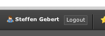
IE8: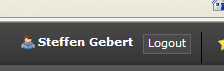
Was it really meant this way? In the screen shots here, there's some space below the separator.
Updated by Felix Kopp about 12 years ago
- File Toolbar-Alternatives.png Toolbar-Alternatives.png added
To address concernes raised yesterday, I took the liberty to re-sketch few alternatives to improve the usability of the toolbar even more.
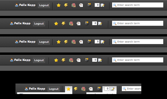
Please find these versions attached.
I personally think that there are two values that might be tuned - (a) spacing between toolbar separator and the (b) length of the separator line itself.
(a) The spacing between the separator and the aligned items on the left and the right side must be equal - but must also depend on the 'active' state. This is especially necessary of the fly out menus. There are answers to the spacing - less or or space. Let us argue:
Generally more space is vertically necessary. Every separator extends the tools bar. On small screens with full toolbars (extra items by extra extensions) smaller spacing might be the better way. On the other hand a larger spacing might - highlight the separator itself even more and/or increase readability due to the larger space.
I decided for the smaller version because the separators themselves are really discreet and do not need to be highlighted by empty space - thanks to the dark coloring. The extra space might not be needed.
(b) The vertical length of the separator lines could begin with the text/icons and stop at the bottom of the text/items. Or start and the viewport/screen and end aligned with the bottom of the text/icons. Or start with the text and end with the end of the toolbar column.
I think that ending with the toolbar make most sense because: The module and tree navigation also have separators / highlight elements that start with the text and end the section.
I am happy to invest more time and change the layout of the separator lines to get a almost perfect solution.
What do you think?
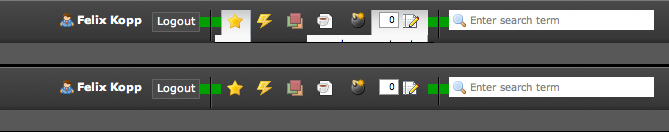
Updated by Jens Hoffmann about 12 years ago
I would like to add a clear grid below.
Currently it seems a bit random to me.
- Red Squares: are 12px*12px big
- Separators: are 30px hight
What do you thing?
Updated by Jens Hoffmann about 12 years ago
And can we a GIF/PNG for the sep. to avoid cross-browser issues? :)
Updated by Felix Kopp about 12 years ago
Hi Jens, the Grid is not random. The Spacings between the lins and the content are equal but you did not consider that the content does not begin with the icon but with the white background, when and fly out is opened. Please see my earlier comment and attachment:

Updated by Felix Kopp about 12 years ago
Updated by Felix Kopp about 12 years ago
Summary:
- I will change the spacing to 12px.
- Separators will only be 30px tall
- Spacing will end at the beginning of the white background when active so inactive icons will look inequal
Ok?
 Updated by Oliver Hader about 12 years ago
- Target version changed from 1525 to 4.7.0-beta1
 Updated by Riccardo De Contardi over 6 years ago
- Status changed from Resolved to Closed