Task #53651
closedBring back module menu accordions
100%
Description
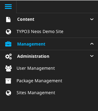
The accordion arrows (down and to the right) were dropped during the "become spacious" patch (#49735).
The missing accordion arrows were missed by some and also the UX team noted that its not clear anymore that those sections can be expanded and collapsed for a new user.
See also comments here:
https://projects.invisionapp.com/d/main#/console/481308/10259949/comments/6159633
So we should bring back the accordion arrows.
Files
 Updated by Gerrit Code Review about 11 years ago
- Status changed from Accepted to Under Review
Patch set 1 for branch master of project Packages/TYPO3.CMS has been pushed to the review server.
It is available at https://review.typo3.org/25415
 Updated by Ernesto Baschny about 11 years ago
Jens will provide a suggestion on how it should could look like and new icons.
 Updated by Jens Hoffmann about 11 years ago
- File arrow-example-application.jpg arrow-example-application.jpg added
- File arrows-sidemenu-8bit.png arrows-sidemenu-8bit.png added
Here you go :)

Example:
 Updated by Gerrit Code Review about 11 years ago
Patch set 2 for branch master of project Packages/TYPO3.CMS has been pushed to the review server.
It is available at https://review.typo3.org/25415
 Updated by Gerrit Code Review about 11 years ago
Patch set 3 for branch master of project Packages/TYPO3.CMS has been pushed to the review server.
It is available at https://review.typo3.org/25415
 Updated by Gerrit Code Review about 11 years ago
Patch set 4 for branch master of project Packages/TYPO3.CMS has been pushed to the review server.
It is available at https://review.typo3.org/25415
 Updated by Gerrit Code Review about 11 years ago
Patch set 5 for branch master of project Packages/TYPO3.CMS has been pushed to the review server.
It is available at https://review.typo3.org/25415
 Updated by Gerrit Code Review about 11 years ago
Patch set 6 for branch master of project Packages/TYPO3.CMS has been pushed to the review server.
It is available at https://review.typo3.org/25415
 Updated by Gerrit Code Review about 11 years ago
Patch set 7 for branch master of project Packages/TYPO3.CMS has been pushed to the review server.
It is available at https://review.typo3.org/25415
 Updated by Felix Kopp about 11 years ago
Let us use empty arrows as in neos for up/down.
What do you think?

 Updated by Ernesto Baschny about 11 years ago
Felix Kopp wrote:
Let us use empty arrows as in neos for up/down.
What do you think?
I think they don't really fit our backend. The filled arrows are used throughout our backend and having those in a discrete light gray is a good solution.
The migration to this kind of "thinner icons" should be accompanied with a whole revamp on all icons, post 6.2.
 Updated by Ernesto Baschny about 11 years ago
- Status changed from Under Review to Resolved
- % Done changed from 0 to 100
Applied in changeset 20103b3c297acfbdb5dafe4ea84c3d859bf5ebb6.
 Updated by Jens Hoffmann almost 11 years ago
The TYPO3 CMS Accordion Arrows are different (as you say).
And for v6.2 I would keep it to the filled once, as in our screens.
 Updated by Riccardo De Contardi about 7 years ago
- Status changed from Resolved to Closed