Bug #78680
closed
UX: Confirmation dialogue has unusual highlighting
0%
Description
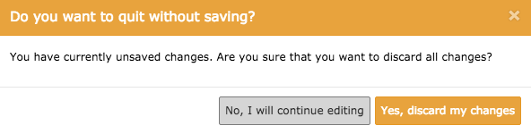
If you want to exit a content element without saving in TYPO3 7.6, the "Yes, I'm sure" button is highlighted.
In my experience, confirmation dialogues tend to highlight the "safer" action, so if you want to exit a content element without saving, the highlighted button normally will be "No, I will continue editing".
I'm posting this after I've tripped over it for about the 30est time.
I'm only used to OS X dialogues, and I haven't checked what Nielsen says about it either :-)
Files
 Updated by Riccardo De Contardi about 8 years ago
I think that this is the same issue: https://forge.typo3.org/issues/72124 could you confirm?
 Updated by
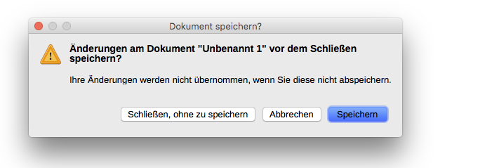
Updated by Riccardo De Contardi about 8 years ago
- Status changed from New to Closed
@Urs Braem no problem; thank you for your quick answer. I close your issue as a duplicate of #72124, please continue the discussion there.
I added your issue as reference to keep a track of it.