
Actions
Bug #103534
open
UX: Backend Page Module - Content Elements drag-n-drop grab-area not visually distinguable
Status:
New
Priority:
Should have
Assignee:
-
Category:
Backend User Interface
Target version:
-
Start date:
2024-04-04
Due date:
% Done:
0%
Estimated time:
TYPO3 Version:
12
PHP Version:
Tags:
UX
Complexity:
Is Regression:
Sprint Focus:
Description
In Page Module for new editors the visual hint that Content Elements can be moved by drag-n-drop is missing.
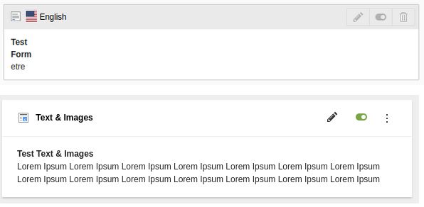
Old TYPO3 v11 vs. new design proposal:
- Above: old - gray bar is grab-area to move Content Element
- Below: design proposal - thin line divides header-area which is grabbable from non-grabbable content-area
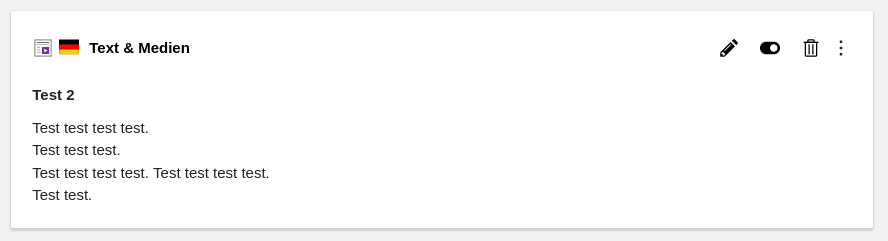
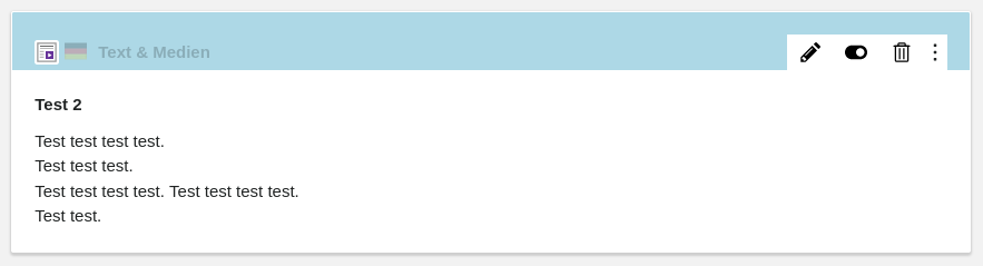
Actual implementation in TYPO3 v12
- Above: as-is
- Below: as-is - actual grabbable area highlighted (blue)
How to fix?
Any ideas on how to make the grabbable area visually distinguable?
Maybe add a button like for IRRE records - e.g. media assets?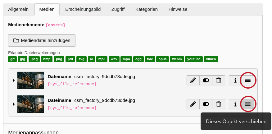
Files
 Updated by Ayke Halder 8 months ago
- Related to Task #95244: The content element boxes are visually cluttered added
 Updated by Riccardo De Contardi 8 months ago
- File example1.png example1.png added
Media asset elements (IRRE) use an icon because the icon is the only part that can be grabbed to perform the Drag & Drop.
for the CE in page view, when you hover the draggable part, the cursor changes to cursor:move
I agree that the visual hint of the changed cursor is a bit scarce :)
a couple of suggestions
1. just a background change on hover
2. make an icon appear on hover like this (very rough mockup, just to give you the idea)
Actions