

Bug #18537
closed
Vertical aligned Icons in List-Module
0%
Description
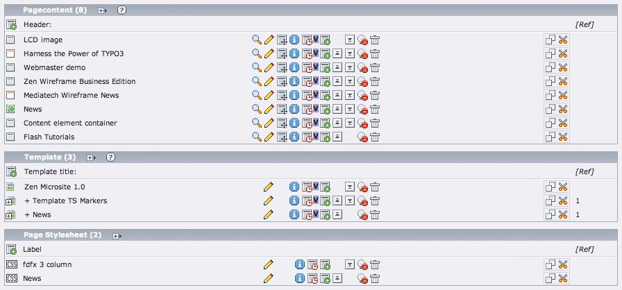
All Content-Elements should be aligned in an clear grid at list module.
PLZ, take a look at the difference in the ScreenShots :)
(issue imported from #M7986)
Files
 Updated by Jens Hoffmann over 16 years ago
Should be enough to add a class to the TR's of the tables with some CSS values ... i guess
 Updated by Steffen Kamper over 16 years ago
I would like to do, but the problem is the kind of render. The whole row is accumulated and rendered at once, using the same td-props.
To get it a special td-class is needed for the title-column to adjust it to a fix width (and overflow:hidden)
Updated by Steffen Kamper over 16 years ago
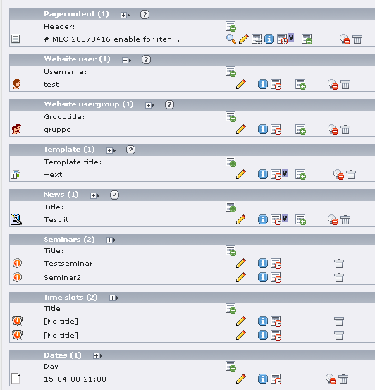
after deeper investigation there is a method for tableClasses, so i added and justified, patch and screenshot is attached
Updated by Steffen Kamper over 16 years ago
There is a small issue left. Crop lenght is 50, which expands the title
column. So i used 30 and used a tooltip with original label only for the
cropped item.
So now the view is really nice and unify.
see 2nd patch and justify_list_table2.png
 Updated by Peter Niederlag over 16 years ago
I have worked on this as well, IMO it makes sense to move the class from the td to the tr tag.
there might be an issue with the localization-view.
I have moved the class from td to tr and changed the order of the localization and clipboard features. My patch is attached but still has some glitches with wording and doesn't take care of missing icons in the ctrl-column.
 Updated by Ben van 't Ende over 16 years ago
I do not agree with your patch, Peter. It gives a totally different feeling with the moved icons. The crop Steffen did was just about a very subtle improvement in usability and gives a clean list overview. This way we could make sure the (first) impression is not that chaotic as it is now. The cropping feature is something everyone will understand as this is default behaviour for most apps these days.
Updated by Peter Niederlag over 16 years ago
well, it was not my idea at all. ;) have a look at the screens from our usability guru jens: List-Grid-OK.png
I just implemented that! This way all icons and columns are aligned in a pretty good fashion (working with localization-view as well).
By "moved Icons" you mean the empty gaps if the icon is not applicable for a certain table, right?
Updated by Steffen Kamper over 16 years ago
Hi Peter,
i don't agree with your patch too, it's not like jens suggestion
- moved the clipboard icons
- gap between first icon and next column
- breaks compatibility, eg check out rupi's tt_news-modul, that doesn't work with your patch
I also followed jens screen, and the only point i agree is to move the localisation columns after the icon block
btw - the crop feature was needed to have a unique column width for header, the tooltip is a good usibility feature for cropped items.
Updated by Peter Niederlag over 16 years ago
Steffen, I am (almost) fine with your patch as well, no problem.
========== duplicate class-params ===============
There's still a (small) issue with duplicate class-params in your patch though (which was there beforehand of course but didn't show up), there are the following variables that might carry (CSS-)class-definitions:
$tdParams && $this->oddColumnsTDParams
-> resolved into $tdP[0|1] within the method addElement()
$this->addElement_tdParams[$lastKey] will still add an extra class-param (except for the icon-column), you can see this in Module web/info/records-statistics, which uses the same method addElement()
To avoid the str_replace-stuff I tried to clean it up and changed $tdParams into $trParams
========== column sizes =======
20px seems very low for the icon-column, I'd suggest 40px 'cause that'll work with localization-view as well
control- and clipboard-columns seem way to large to me
(I am using sysext:t3skin)
========== compatibility with typo3/stylesheet.css and t3skin ======
CSS should be adapted for typo3/stylesheet.css as well as SYSEXT:t3skin
I'll attach my revised and latest patch in a minute, maybe you want to have a look at it again, we just need to submit it soon, since RC2 is coming up the line ...
Updated by Steffen Kamper over 16 years ago
Hi Peter,
i tested your patch, and it's a lot better now.
I found a major issue:
The news-admin-modul doesn't work, there are no table-tags.
Check it out:
http://rgdata.de/fileadmin/user_upload/T3X_tt_news-2_6_0-z-200804061826.t3x
the secod is a minor one:
the iconblock ist not unify. It seems that the blanc-gifs doesn't have same width like the icon. i attached a screenshot which shows it
last one question: why do you use 40px fpr first column? The icons are 16px so you have a space of 24 px which is a bit to lot imho, but it's minor too
Updated by Peter Niederlag over 16 years ago
Hi Steffen, thx for provdiding screenie and tt_news.
I will look into the tt_news-admin module, probably this is really due to the slightly changed behaviour. The change is not fully backwards-compatible, but might be worth the change.
there is some bug on the root-page with the unified iconblock I didn't find out yet. It is really difficult to get the right size of the icons, espacially since they might even differ. ;(
I am using 40px for the first column, because when you enable localization-view in db-list, the icon of translated records get a 20px (?) margin-left. They are indented to show the belonging. With 40px this fits nicely in there.
If you want to help, it would be great if we could move the "create new record" link from the clipboard-column to the first (icon) column, as suggested by Jens screen.
Updated by Steffen Kamper over 16 years ago
ah, now i got it :-)
ok, i will look to this issue.
Updated by Steffen Kamper over 16 years ago
i attached a patch for the header icon only, so you can see how it's done
Updated by Peter Niederlag over 16 years ago
thx, seems we are getting this "no-brainer" ;)
@create icon:
if you just use $theIcon, the the count of columns will be wrong, therefor I added an empty $theData[$fCol]='%nbsp;';
I fixed the bug with the tt_news BE-Module (missing a space character before the class-attribute).
I'll attach '_IV' of my patch.
From what I found no extensions should have problems with this, but still css for typo3/stylesheet.css is missing ;(
Updated by Steffen Kamper over 16 years ago
looks good now :-)
i would use bold for the header(link) to have it more prominent.
For stylesheet - just copy the css to stylesheet, would be the easiest way, i will check later.
Updated by Steffen Kamper over 16 years ago
the bold header is easy done with
table.typo3-dblist tr.c-headLine td.col-title a {
width: 240px;
display: block;
font-weight:bold;
}
Updated by Steffen Kamper over 16 years ago
i did this and splitted the css with stylesheet.css, so that it also works without t3skin
thx for the teamwork Peter, good work!
I put last patch now in corelist for review
Updated by Steffen Kamper over 16 years ago
one small issue is added in last patch:
Header got a more height so that there is more distance to the listrows
 Updated by
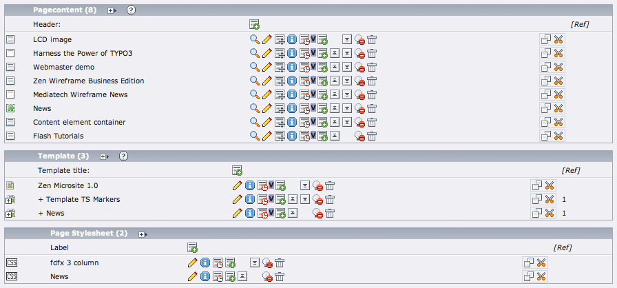