Bug #57126
closedTask #55819: UL+OL styling
Form Wizard - styling problem
100%
Description
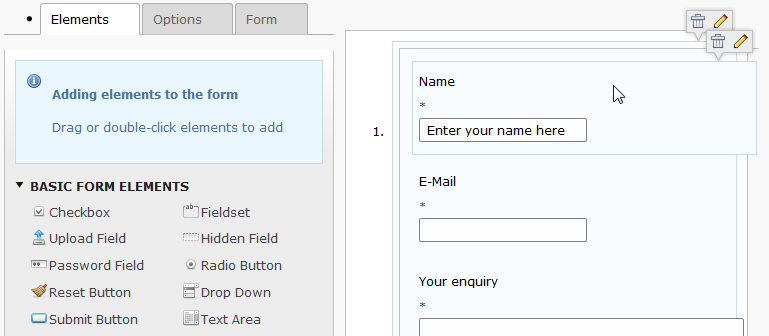
Since unification of UL/OL and changed styling the "raw" UL/OL to the original state (with bullet or number), the Form Wizard displays some these undesired artefacts in the TABs and in the right pane:

Files
 Updated by Ernesto Baschny over 10 years ago
- File form-before.png form-before.png added
 Updated by Gerrit Code Review over 10 years ago
- Status changed from Accepted to Under Review
Patch set 1 for branch master of project Packages/TYPO3.CMS has been pushed to the review server.
It is available at https://review.typo3.org/28585
 Updated by Ernesto Baschny over 10 years ago
- File form-after.png form-after.png added
The Review requests will make it look like this:

 Updated by Marcin Sągol over 10 years ago
- File t3-6.2-dev-form.jpg t3-6.2-dev-form.jpg added
Hi Ernesto,
so this patch should fix only padding of the elements on the right section?
Please take a look also how tooltip (with delete and edit shortcuts) looks like on Kubuntu 14.04 @ Chromium
 Updated by Ernesto Baschny over 10 years ago
Marcin Sągol wrote:
so this patch should fix only padding of the elements on the right section?
Please take a look also how tooltip (with delete and edit shortcuts) looks like on Kubuntu 14.04 @ Chromium
Can you explain what is wrong with them and maybe a screen how it looked before? It looks "ok" to me.
 Updated by Marcin Sągol over 10 years ago
Ernesto the tooltip issue is not related to this list styles.
If we talk what is wrong with them please take a look at your screenshot (trash and pencil icons are both inside the tooltip and its background)and on the one i posted you can see that there is bigger space between icons and pencil is renderd outside tooltip backgound (the tooltiop container is wideer so the background starts to repeat i think).
 Updated by Ernesto Baschny over 10 years ago
- Status changed from Under Review to Resolved
- % Done changed from 0 to 100
Applied in changeset 2d4a9d3c72c568bd16d0c899b3a950ddf97648ab.
 Updated by Riccardo De Contardi about 7 years ago
- Status changed from Resolved to Closed