Actions
Bug #102570
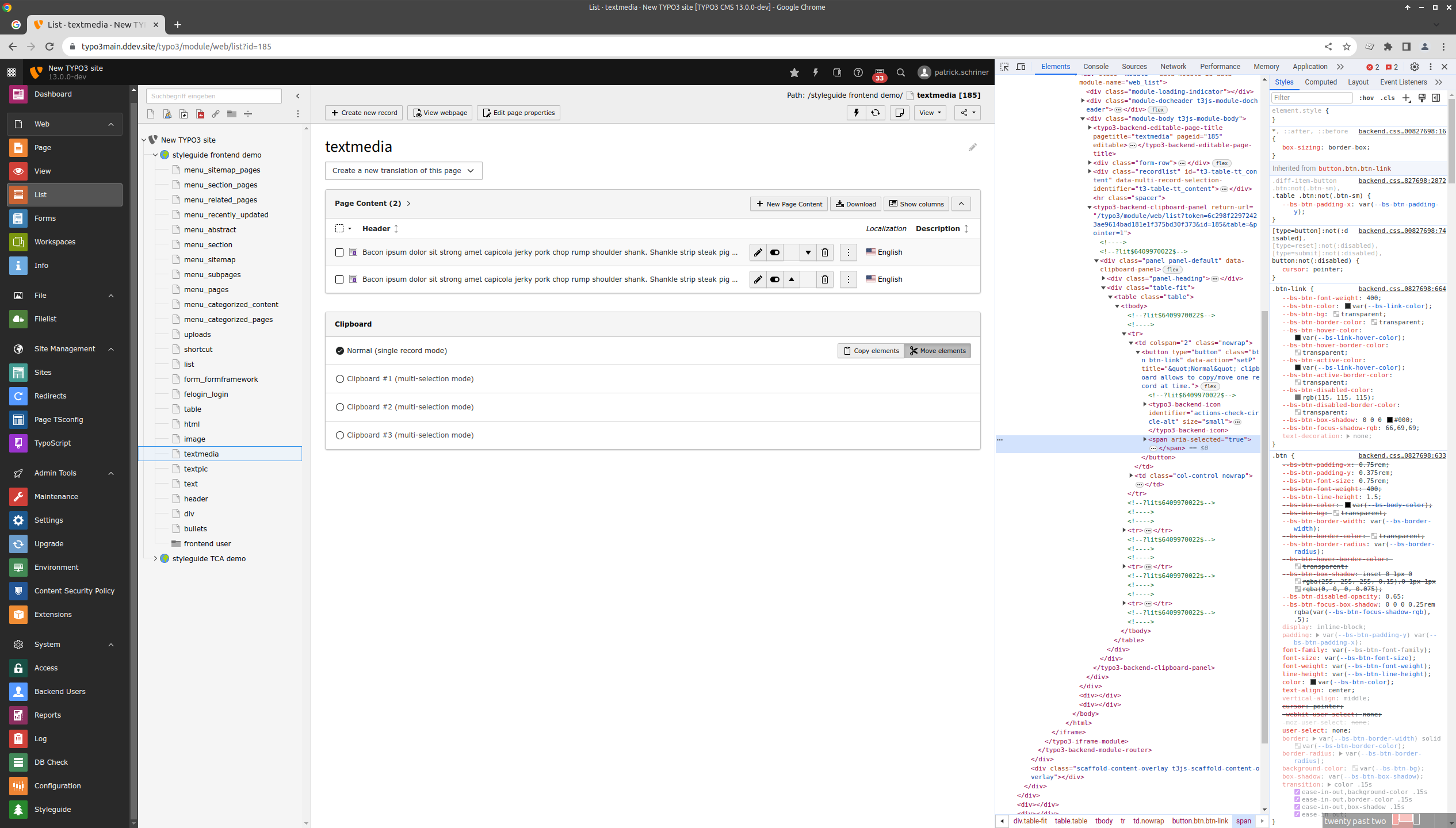
closedClipboard selection is impossible to distinguish for screenreaders
Status:
Closed
Priority:
Should have
Assignee:
-
Category:
Backend User Interface
Target version:
-
Start date:
2023-11-30
Due date:
% Done:
100%
Estimated time:
TYPO3 Version:
13
PHP Version:
Tags:
accessibility,ux
Complexity:
Is Regression:
Sprint Focus:
Description

a) There is no real highlighting of the active state (underline or text)
b) The "checked" icon is purely visual
Files
 Updated by Gerrit Code Review 12 months ago
- Status changed from New to Under Review
Patch set 1 for branch main of project Packages/TYPO3.CMS has been pushed to the review server.
It is available at https://review.typo3.org/c/Packages/TYPO3.CMS/+/82051
 Updated by Elisabeth Zeilinger 12 months ago
In the clipboard you can choose one options out of four, so this is a typical radio button pattern. The best and most inclusive way would be to implement native radio buttons.
<input type="radio" name="clipboard" ...
If this is not possible, you can implement radio buttons with help of ARIA, although there is a lot of JavaScript needed to do this. You can find some CodePen examples in the Examples section of the official ARIA documentation for Radio Group Patterns: [[https://www.w3.org/WAI/ARIA/apg/patterns/radio/]] .
 Updated by Gerrit Code Review 12 months ago
Patch set 1 for branch 12.4 of project Packages/TYPO3.CMS has been pushed to the review server.
It is available at https://review.typo3.org/c/Packages/TYPO3.CMS/+/82114
 Updated by Patrick Schriner 12 months ago
- Status changed from Under Review to Resolved
- % Done changed from 0 to 100
Applied in changeset d81935fccbbfcdf9929a291fc0e25db68ab4761f.
Actions