Task #103380
openUX: Backend Page Module - improve visual topology to distinguish between Page, Page-Column and Content-Element
0%
Description
In the Page Module identical spacing and backgrounds do not give a clear visual clue or guidance to the eye to distinguish the elements Page, Page-Column and Content-Element on first sight.
Identical spacing is in use for- Page to Page-Columns and in between Page-Columns (blue arrows)
- Page-Column to Content-Elements (green arrows)
- Content-Element to inner Content (orange arrows)
- Page: white
- Page-Column: gray
- Content-Elements: white again
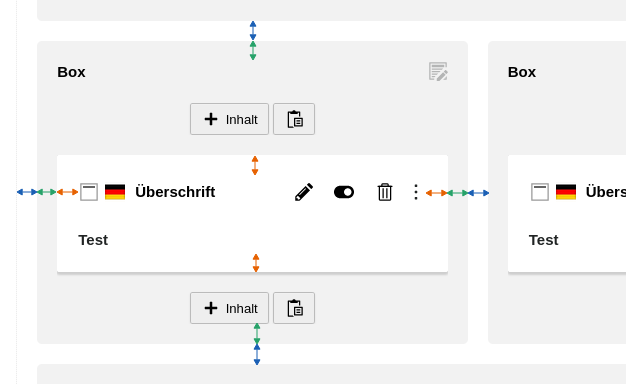
Example: Page Module – current state
Especially on a multi-column page-layout with multiple CEs this becomes cluttered for an editor not working daily in the TYPO3 backend:
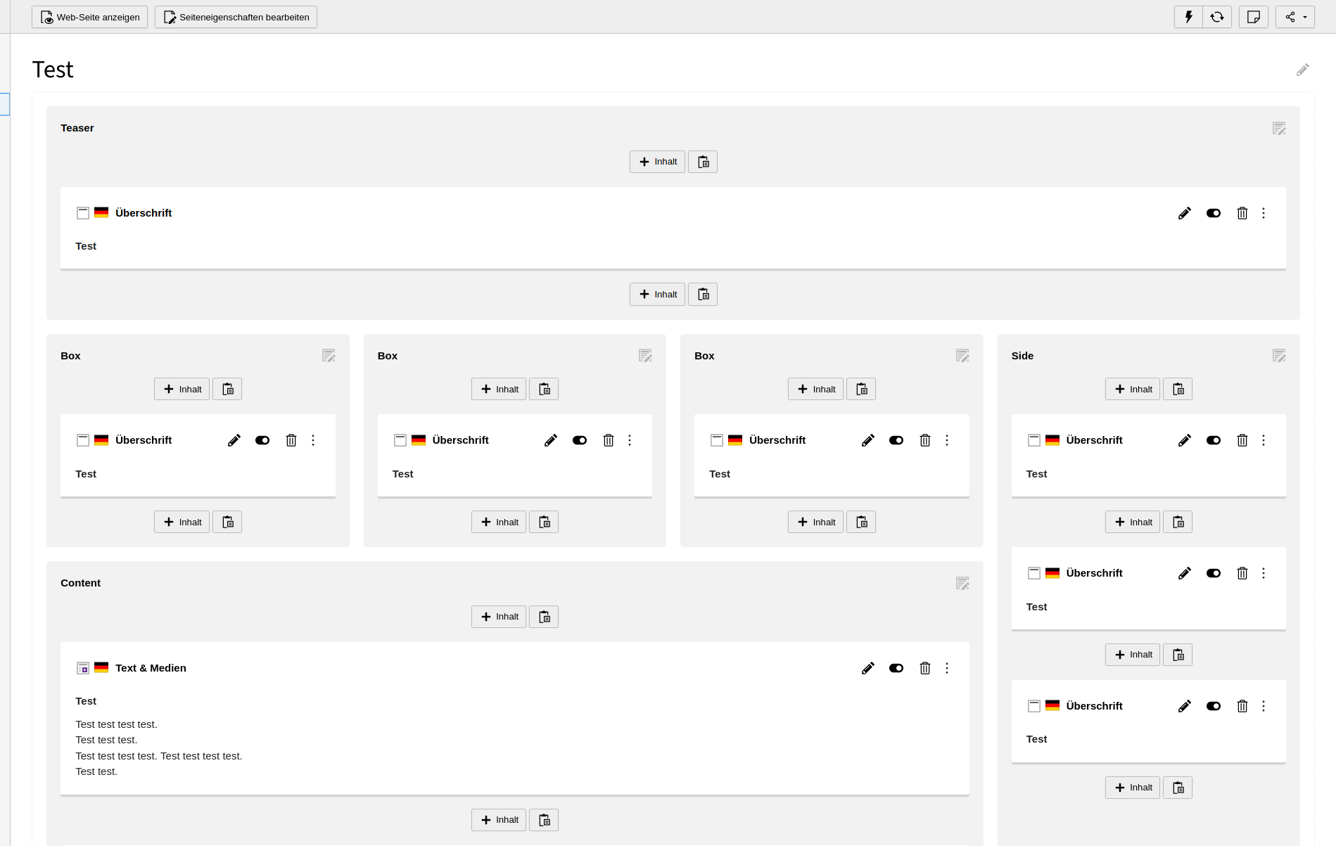
Design idea: reduce spacing for Page-Columns
By reducing the spacing of the Page-Columns, it looks more like one page seperated into gray input areas (= Page-Columns).

Instead of gray boxes put on top of the page:
– Page-Column spacing doubled for simulation purpose.–
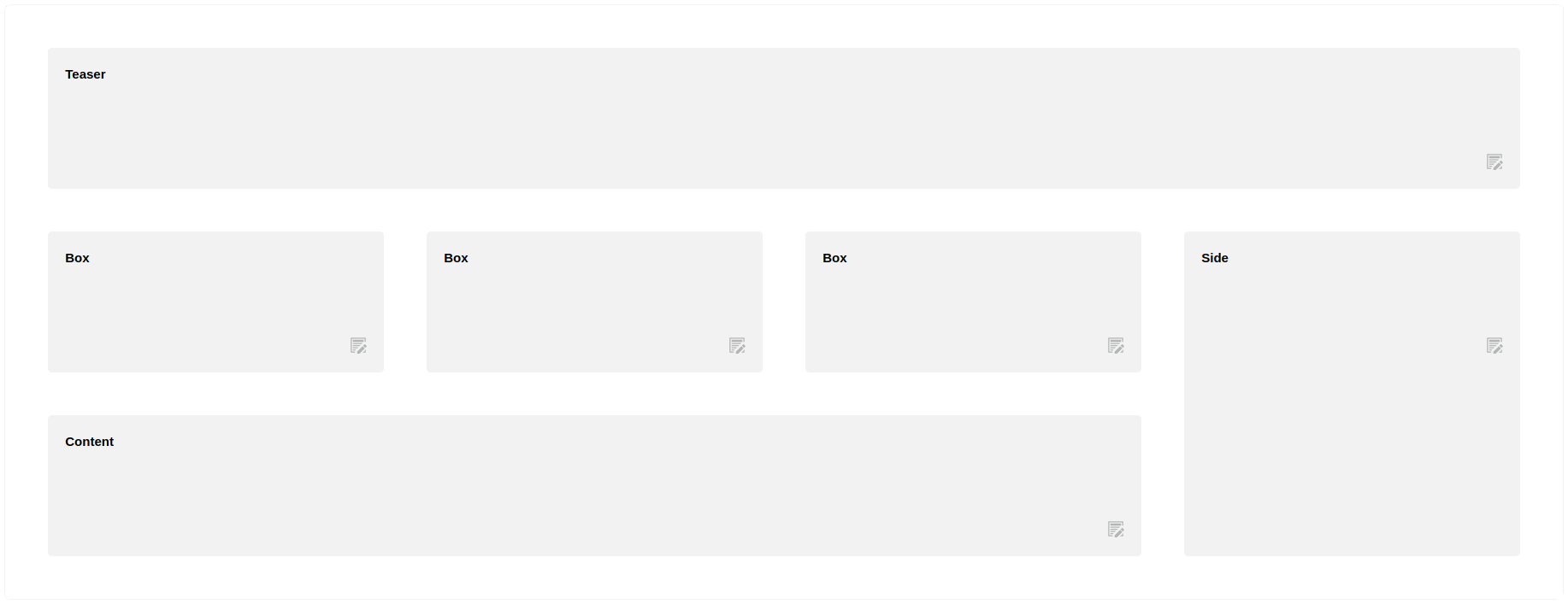
Example: Page Module – with reduced Page-Column spacing
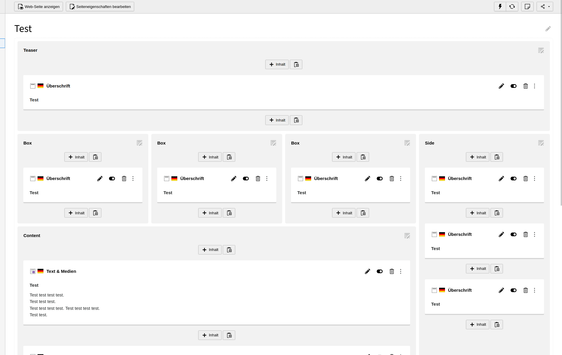
Reduced spacing of the Page-Columns makes the page with its columns become the background.
No change on the design of Content-Elements:
The Content-Elements are put on top - as highlighted by the "drop-shadow below CEs.
Files
 Updated by Ayke Halder 8 months ago
- Related to Bug #103386: UX: Backend Page Module - remove dotted gray line around the whole page added
 Updated by Ayke Halder 8 months ago
· Edited
- File clipboard-202403131145-8jo1v.png clipboard-202403131145-8jo1v.png added
- Target version set to 13 LTS
The grid-column-styles are also used on Page Module translation-view. (And might also be used in workspaces?)
In translation-view the column-spacing (border-spacing-x) must stay as is or even be upsized. The row-spacing (border-spacing-y) should be reduced.

So this is some major change.
 Updated by Ayke Halder 8 months ago
- Related to Task #95229: The colPos of the page module are visually cluttered added
 Updated by Gerrit Code Review 8 months ago
- Status changed from New to Under Review
Patch set 1 for branch main of project Packages/TYPO3.CMS has been pushed to the review server.
It is available at https://review.typo3.org/c/Packages/TYPO3.CMS/+/83672
 Updated by Gerrit Code Review 8 months ago
Patch set 2 for branch main of project Packages/TYPO3.CMS has been pushed to the review server.
It is available at https://review.typo3.org/c/Packages/TYPO3.CMS/+/83672
 Updated by Gerrit Code Review 8 months ago
Patch set 3 for branch main of project Packages/TYPO3.CMS has been pushed to the review server.
It is available at https://review.typo3.org/c/Packages/TYPO3.CMS/+/83672
 Updated by Ayke Halder 8 months ago
- File clipboard-202404051630-gv2ij.png clipboard-202404051630-gv2ij.png added
- File clipboard-202404051634-i1th6.png clipboard-202404051634-i1th6.png added
- TYPO3 Version changed from 12 to 13
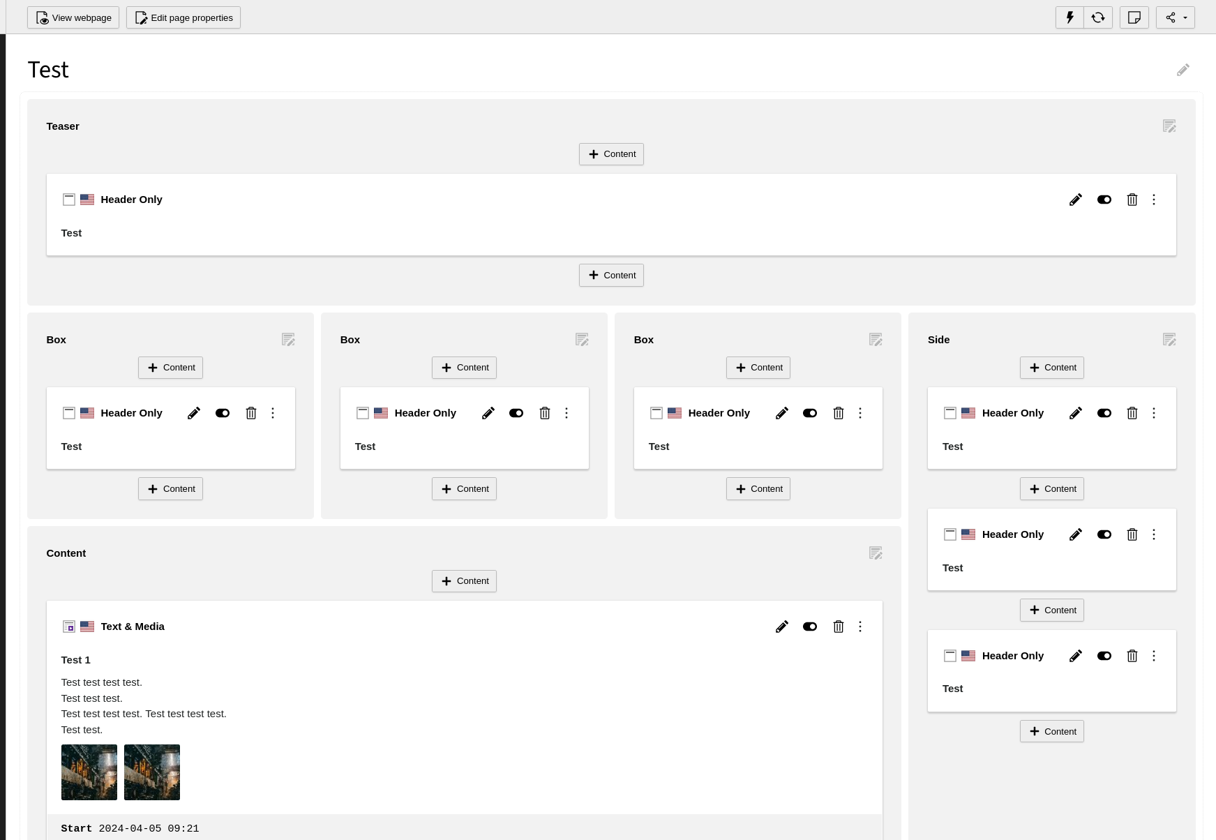
Grid with different spacings (new)
--pagemodule-grid-spacing: .5rem;
--pagemodule-grid-inner-spacing: 1.375rem;
--pagemodule-element-spacing: .625rem;
--pagemodule-element-inner-spacing: 1rem;
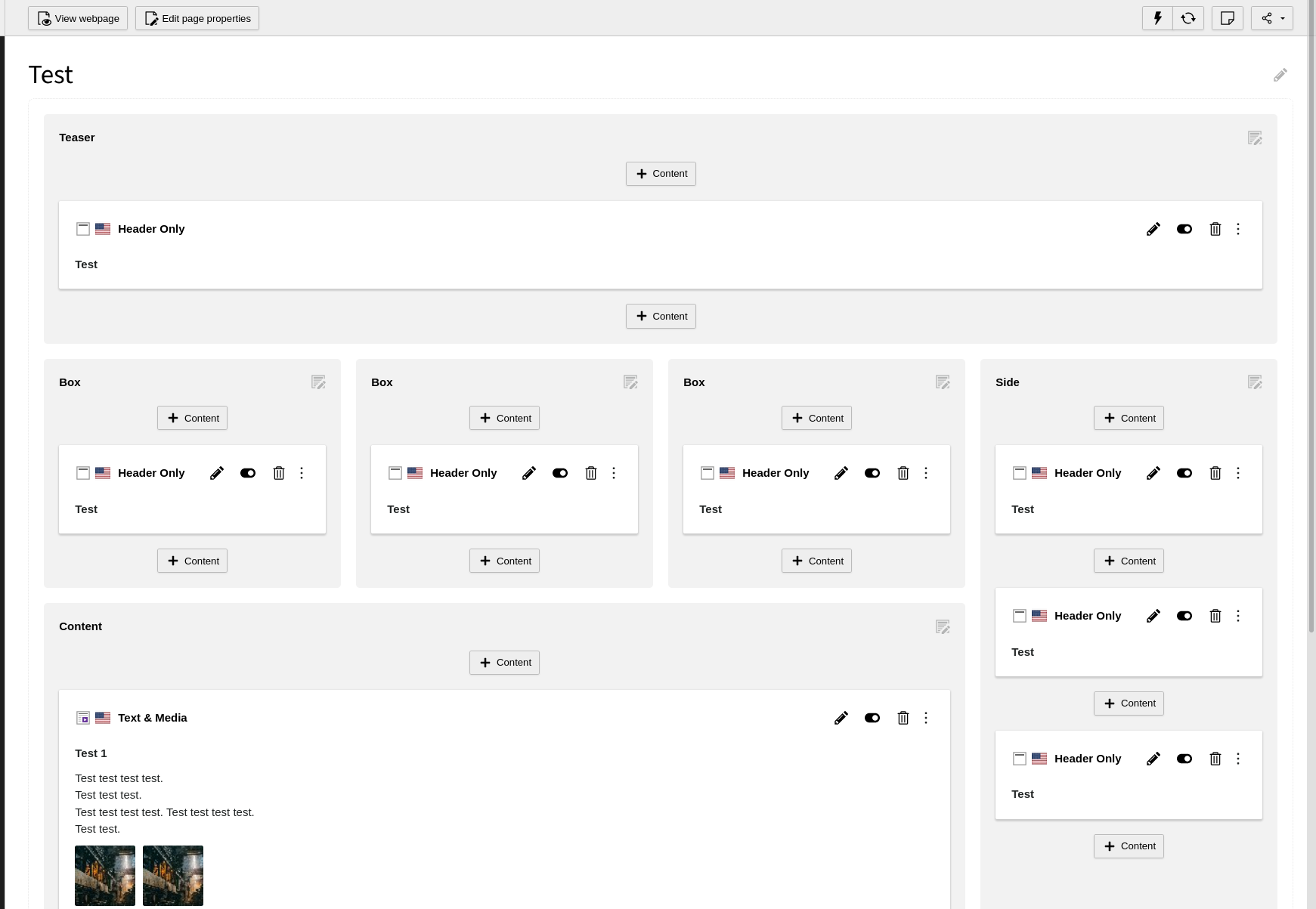
Grid with identical spacings (TYPO3 as-is)
--pagemodule-grid-spacing: 1rem;
--pagemodule-grid-inner-spacing: 1rem;
--pagemodule-element-spacing: 1rem;
--pagemodule-element-inner-spacing: 1rem;
 Updated by Ayke Halder 8 months ago
- Related to Feature #103539: UX: Backend Page Module - hide CEs buttons and simplify new content buttons to declutter view added
 Updated by Gerrit Code Review 4 months ago
Patch set 4 for branch main of project Packages/TYPO3.CMS has been pushed to the review server.
It is available at https://review.typo3.org/c/Packages/TYPO3.CMS/+/83672
 Updated by Benni Mack about 1 month ago
- Target version changed from 13 LTS to Candidate for Major Version