Task #103380
openUX: Backend Page Module - improve visual topology to distinguish between Page, Page-Column and Content-Element
0%
Description
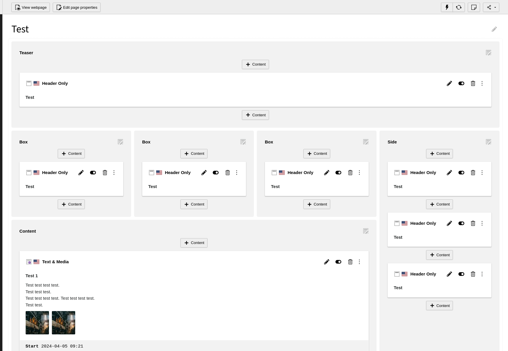
In the Page Module identical spacing and backgrounds do not give a clear visual clue or guidance to the eye to distinguish the elements Page, Page-Column and Content-Element on first sight.
Identical spacing is in use for- Page to Page-Columns and in between Page-Columns (blue arrows)
- Page-Column to Content-Elements (green arrows)
- Content-Element to inner Content (orange arrows)
- Page: white
- Page-Column: gray
- Content-Elements: white again
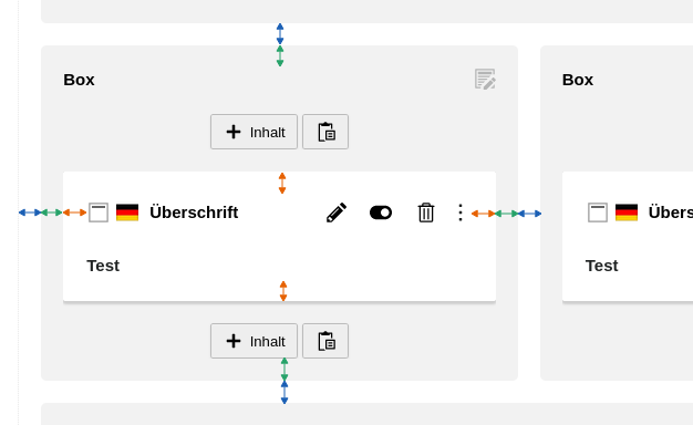
Example: Page Module – current state
Especially on a multi-column page-layout with multiple CEs this becomes cluttered for an editor not working daily in the TYPO3 backend:
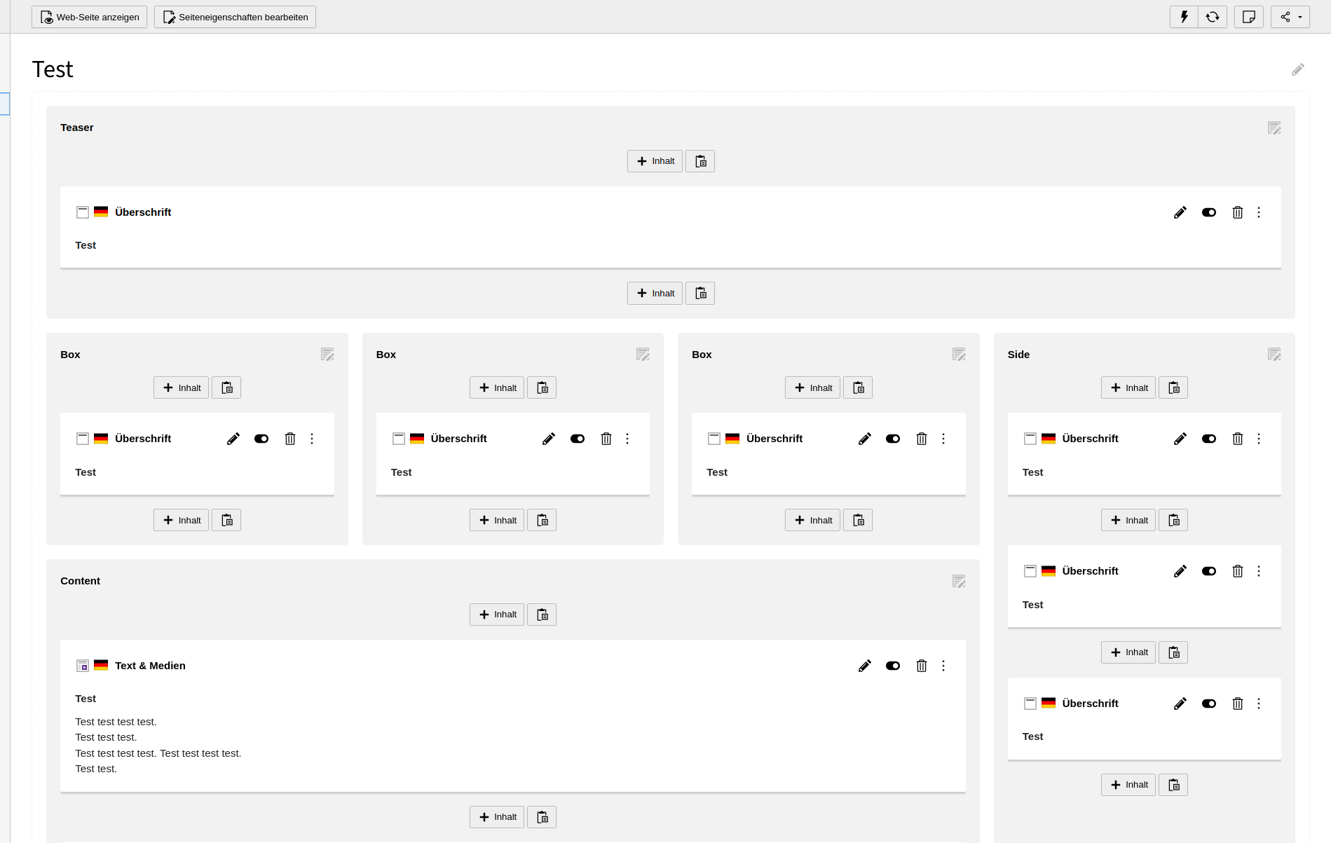
Design idea: reduce spacing for Page-Columns
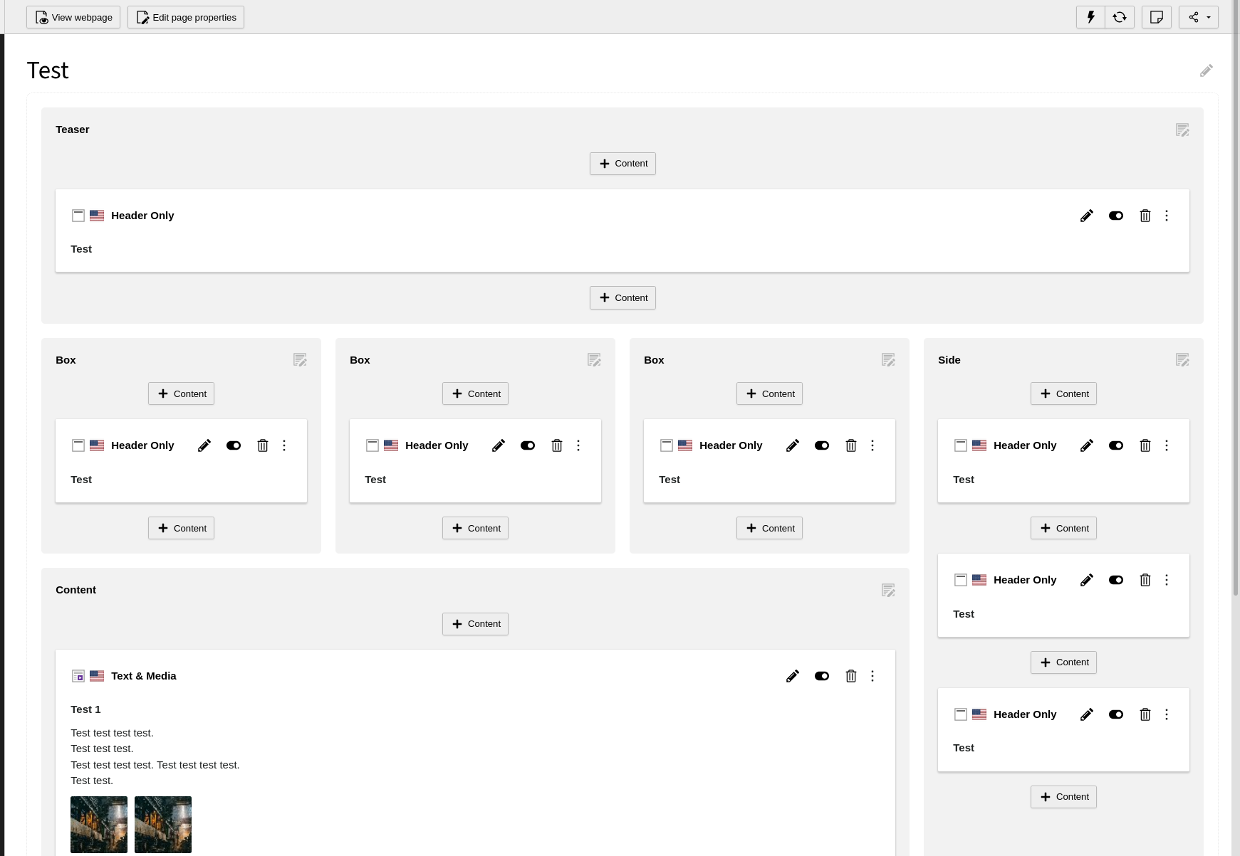
By reducing the spacing of the Page-Columns, it looks more like one page seperated into gray input areas (= Page-Columns).

Instead of gray boxes put on top of the page:
– Page-Column spacing doubled for simulation purpose.–
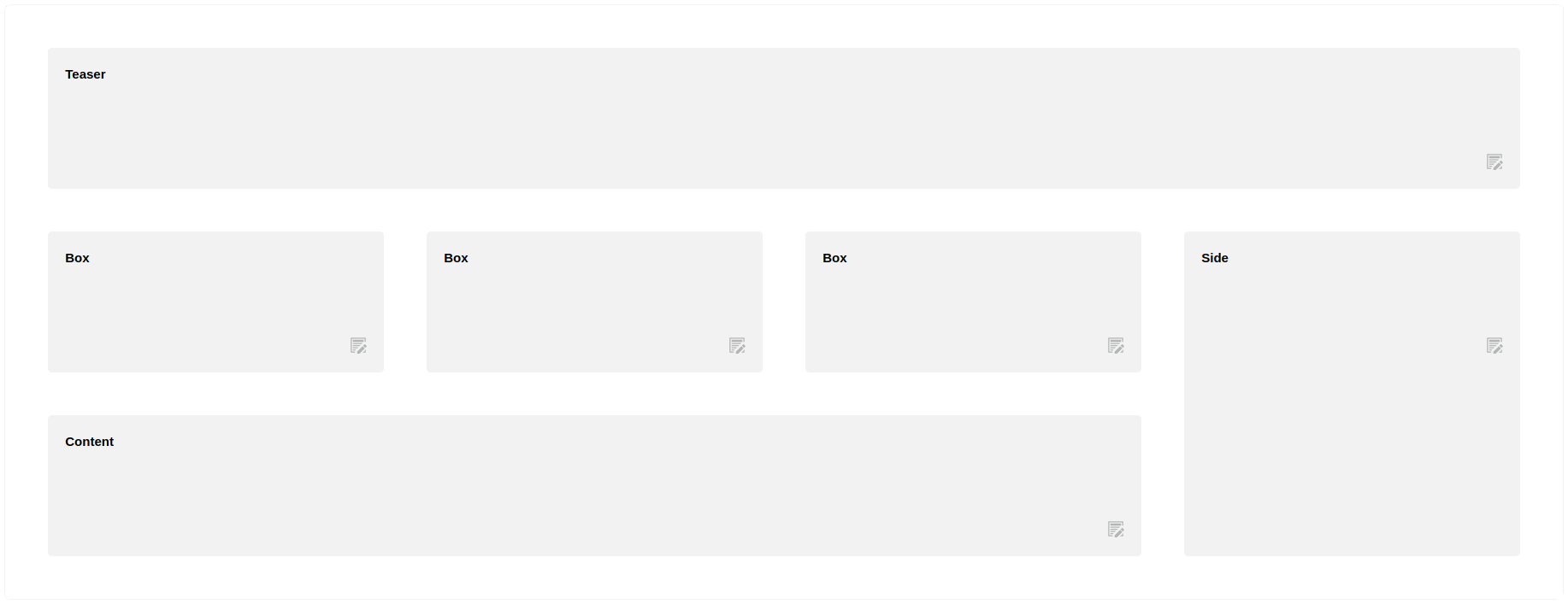
Example: Page Module – with reduced Page-Column spacing
Reduced spacing of the Page-Columns makes the page with its columns become the background.
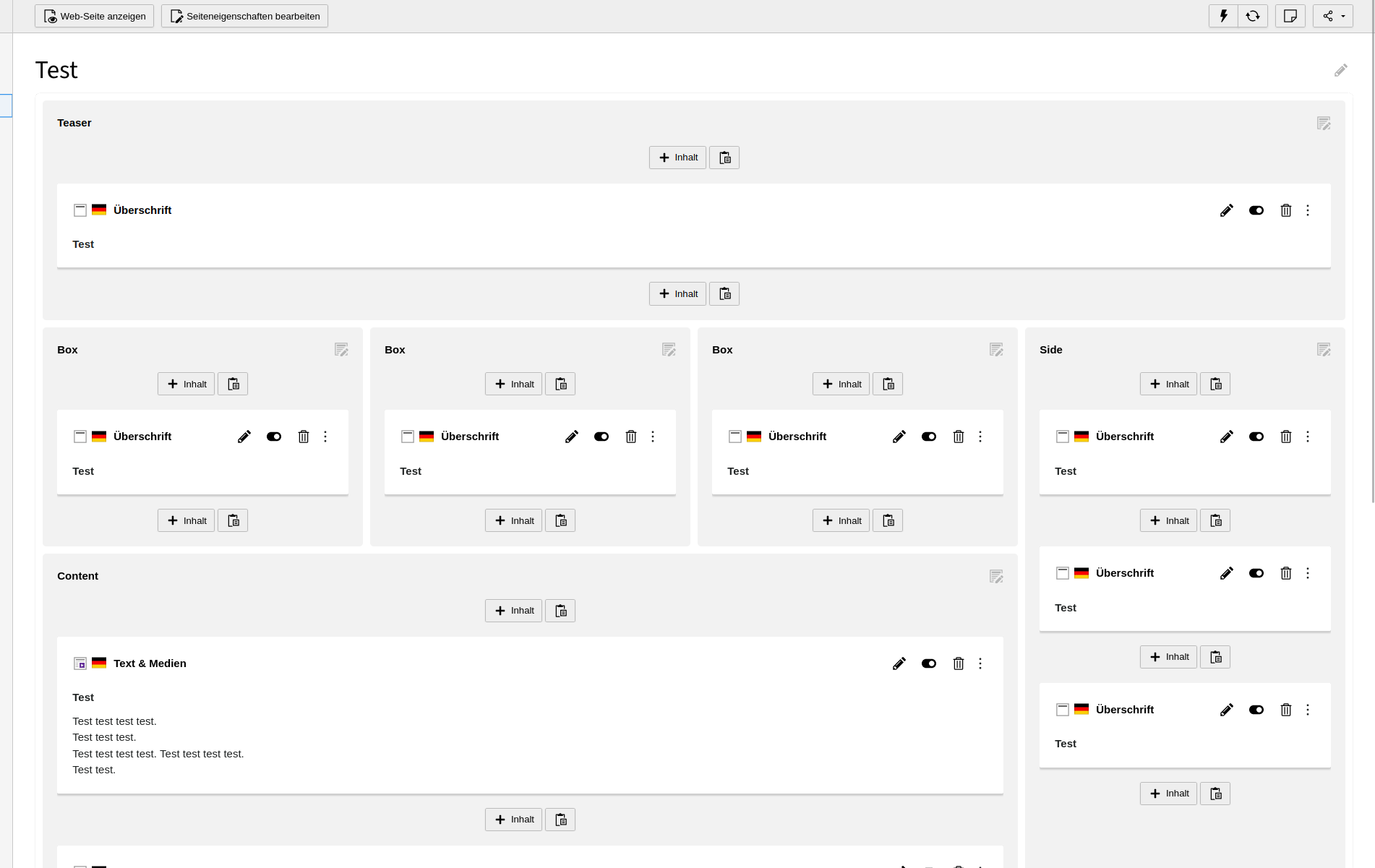
No change on the design of Content-Elements:
The Content-Elements are put on top - as highlighted by the "drop-shadow below CEs.
Files

