Actions
Bug #103457
closedUI inconsistency - search icon wrong position on Form module
Status:
Closed
Priority:
Should have
Assignee:
-
Category:
Backend User Interface
Target version:
-
Start date:
2024-03-21
Due date:
% Done:
0%
Estimated time:
TYPO3 Version:
13
PHP Version:
8.0
Tags:
Complexity:
Is Regression:
Sprint Focus:
Description
Steps to reproduce:
On the Form module the search bar the lens icon is placed on the left side of the bar:

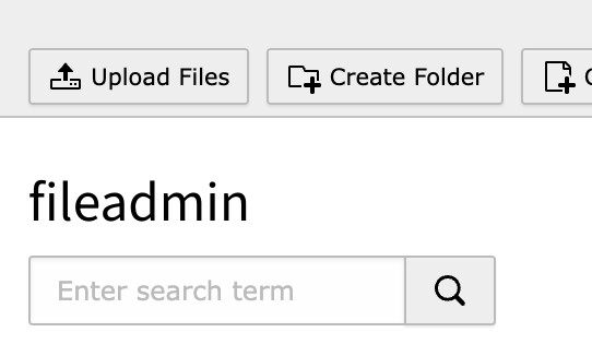
This is not consistent with the TYPO3 interface where the icon is on the right side (e.g. on the Filelist module):

Files
 Updated by Simon Schaufelberger 8 months ago
- Related to Bug #103458: UX inconsistency - the "lens" button on several search bars is disabled until something is entered on the field added
 Updated by Andreas Kienast 8 months ago
I think this duplicates #103404, doesn't it?
 Updated by Simon Schaufelberger 8 months ago
- Is duplicate of Bug #103404: standardize search field and its search icon location added
 Updated by Riccardo De Contardi 8 months ago
- Status changed from New to Closed
Closed as a duplicate
 Updated by Simon Schaufelberger 8 months ago
- Related to Feature #97664: Search field for form manager added
Actions