Bug #104229
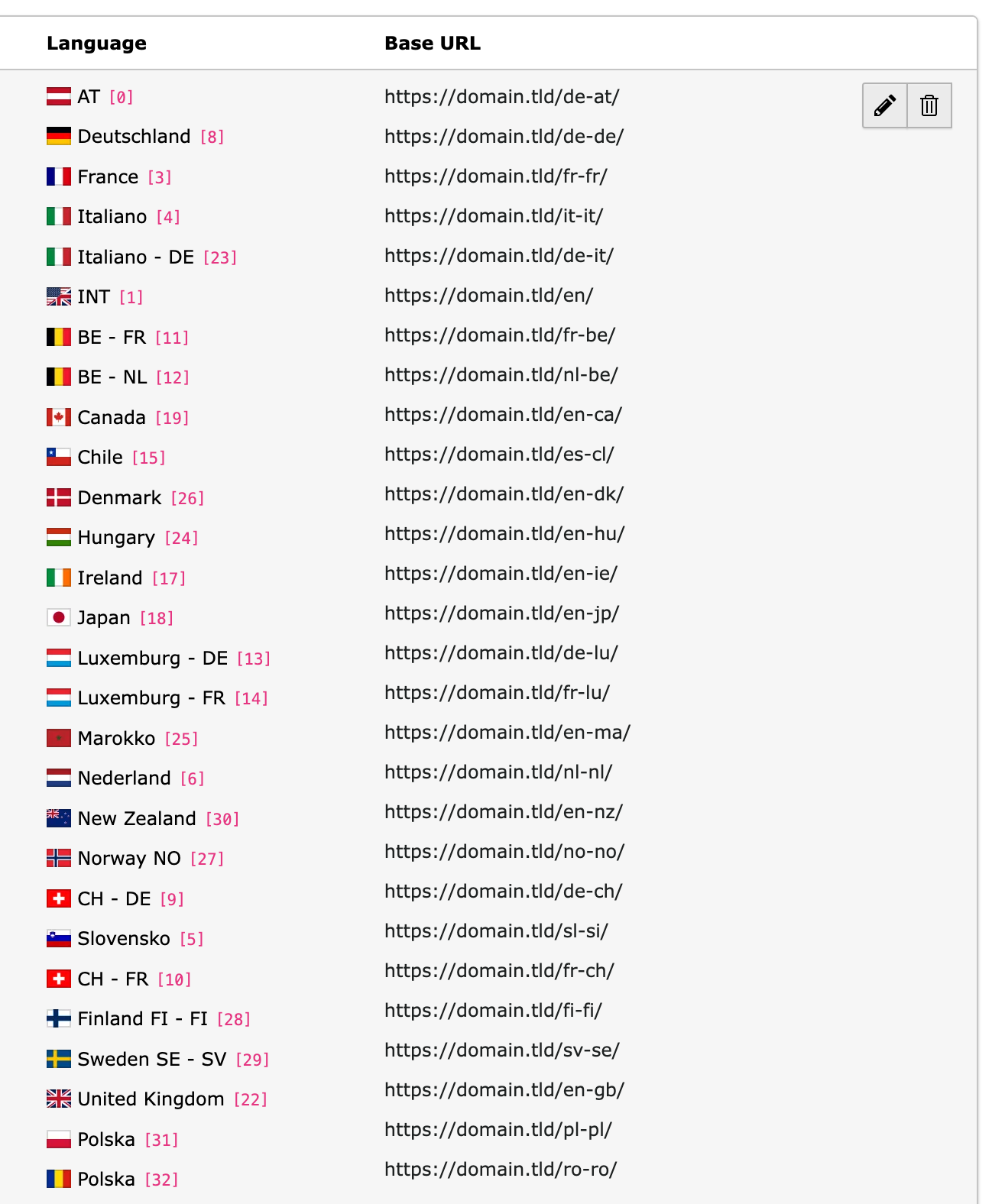
closedsite languages in overview not in line
0%
Description
If there are many site languages, the language and domains are not in line anymore. the reason is that language id using a code-tag and this is too big 
Files
 Updated by Jasmina Ließmann 5 months ago
- Status changed from Accepted to Needs Feedback
I tested on Windows with the latest Chrome and Firefox and unfortunately could not reproduce the reported behavior. With which operating system and browser does the problem occur?
 Updated by Georg Ringer 5 months ago
chrome (126.0.6478.127) on mac, firefox looks good
 Updated by Riccardo De Contardi 5 months ago
· Edited
I am guessing that this issue depends on the hardware in use and not on the browser itself.
On TYPO3 12 on windows using my laptop I have seen that:
- each line ( <div> ) in the cell under the column "Language" has a calculated height of 18.42px
- each line in the cell under the "Base URL" has a calculated height of 18px
therefore the misalignment which becomes noticeable starting from 4-5 items.
But I have seen this difference only on the main screen of the laptop ; moving the window on an external monitor with a higher resolution the calculated height of both is always 18px!
I assume that this difference depends on the screen resolution settings: the main screen of the laptop is scaled at 150% (Windows default). I tried switching the scaling to 100% to use the "natural" 1920x1080 resolution and the issue is gone (18px on both columns).
I have not tested it on version 13 but from a brief look at the HTML table code I don't think there will be difference between TYPO3 12 and 13.
[UPDATE]
I've performed a rough test but I've seen that using display:flex on the divs under the "Language" column seems to help
So something like:
<div class="d-flex align-items-center mb-2">... </div>
(Note: the last div has no mb-2 class (to adjust the margin))
 Updated by Georg Ringer 5 months ago
- Status changed from Needs Feedback to Closed
yeah a lot better in v13, closing it