Actions
Bug #31186
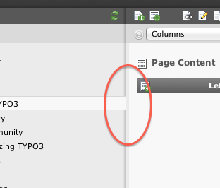
closedAwkward styling of split bar in Chrome browser
Status:
Closed
Priority:
Must have
Assignee:
Category:
Backend User Interface
Target version:
Start date:
2011-10-22
Due date:
% Done:
100%
Estimated time:
TYPO3 Version:
4.6
PHP Version:
Tags:
Complexity:
Is Regression:
Sprint Focus:
Description
 Due to a recente change (#27660), the Ext JS split bars, which act as
separators between module menu / navigation and navigation / content
container, are increased in width only for the Chrome browser.
This breaks the styling and makes it look lovelessly implemented, when
the selected page from the tree should have a visual connection to the
content frame.
Files
 Updated by Mr. Hudson about 13 years ago
- Status changed from New to Under Review
Patch set 1 of change Iacca368168d122e9d2df05a22590d21859f6b3cb has been pushed to the review server.
It is available at http://review.typo3.org/6187
 Updated by Steffen Gebert about 13 years ago
- File screenshot.png screenshot.png added
 Updated by Xavier Perseguers about 13 years ago
- Status changed from Under Review to Resolved
- % Done changed from 0 to 100
 Updated by Riccardo De Contardi about 7 years ago
- Status changed from Resolved to Closed
Actions