Bug #38263
closedCleanUp ExtJS Layouts for the Backend
0%
Description
The Backend is driven by an ExtJS ViewPort and the ExtJS Layout Manager.
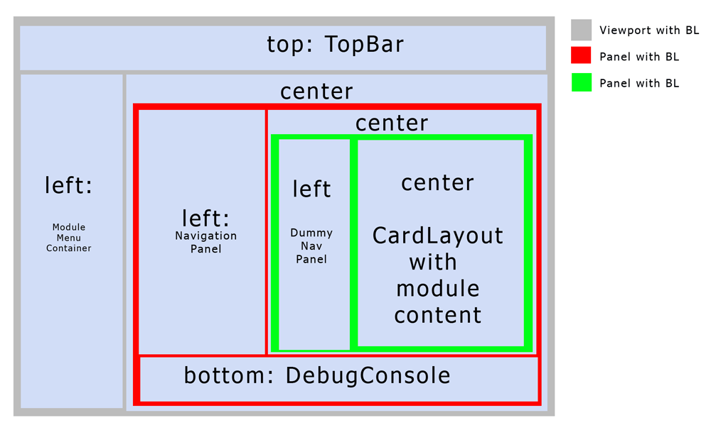
The structure of the Layouts is not optimal - there are 3 nested border-layouts.
Doing that, it is not really suprising that the resizing on small screens wents roke.
As a first step having a more flexible resizing of the backend, this needs to be cleaned up.
Files
 Updated by Steffen Ritter over 12 years ago
- File currentNesting.gif currentNesting.gif added
Current State:
I think:
- all elements which are just a container, should extend container whereever possible (not PANEL!) - saves RAM and LoadingTime,
- nesting of BorderLaoyuts is bad.
- only viewport should have border-Layout.
- Developing happens on Desktop -> WideScreen, Debug Console better on the right.
--> Remove Nested layouts,
--> center of Viewport should be a container with HBOX Layout: Nav1, Nav2, Content, Debug and width defined proportional.
See current nesting about the current mess
 Updated by Kay Strobach over 12 years ago
The best solution IMHO is to create a new layout:
+-------------------------------+
| north                         |
+---+---+-----------------------+
|   |   |                       |
| m | n |      content          |
|   |   |                       |
+---+---+-----------------------+
| south                         |
+-------------------------------+
m and n are resizeable and n is collapsable.
This szenario would force the need of 2 cardlayouts:
- in the n panel, which wraps all possible nav containers
- in the content panel, which contains the new type of modules
The south panel can be empty IMHO and so it can be dropped.
The Debug pane should be integrated in the cardlayout with an indicator icon in the toolbar in the north pane.
This way the Debug output can be formated as a console and so the information can be presented in a more useable way ;)
I'll try to implement a prototype of the layout in the next days.
 Updated by Steffen Ritter over 12 years ago
Kay Strobach wrote:
The best solution IMHO is to create a new layout:
[...]
m and n are resizeable and n is collapsable.
width of m should not be controled by the layout, but automatically use the width of it's children.
Doing so, we solely can work with media-queries/CSS on the module menu variants...
 Updated by Mathias Schreiber almost 10 years ago
- Status changed from New to Closed
- Is Regression set to No
I am closing this since there is a lot of effort going on towards Bootstrap CSS.
We hope to get rid of ExtJS soon :)