Task #57098
closedRemove superfluous margin above #typo3-menu
100%
Files
 Updated by Gerrit Code Review over 10 years ago
- Status changed from New to Under Review
Patch set 1 for branch master of project Packages/TYPO3.CMS has been pushed to the review server.
It is available at https://review.typo3.org/28556
 Updated by most wanted over 10 years ago
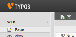
I guess either the gap should be filled with dark grey color or should be removed.
Attached please find a screenshot.
 Updated by most wanted over 10 years ago
this is how it looks after my patch is applied - please see attachment.
 Updated by Mathias Brodala over 10 years ago
Roland Waldner wrote:
this is how it looks after my patch is applied - please see attachment.
This highly depends on the browser rendering. On my system the "WEB" is properly aligned to the bottom border of the darker bar within the module area to the right:

(Unpatched)
 Updated by most wanted over 10 years ago
Mathias Brodala wrote:
This highly depends on the browser rendering. On my system the "WEB" is properly aligned to the bottom border of the darker bar within the module area to the right:
you are right and it looks kind of broken to me. imo, either the gap between the logo and the menu is too big or there is some dark grey bar missing between the logo and the menu.
this it how it looked e.g. in TYPO3 4.7

 Updated by Felix Kopp over 10 years ago
There won't be a bar since the docheader is only relevant for the main section.
 Updated by Gerrit Code Review over 10 years ago
Patch set 2 for branch master of project Packages/TYPO3.CMS has been pushed to the review server.
It is available at https://review.typo3.org/28556
 Updated by Gerrit Code Review over 10 years ago
Patch set 3 for branch master of project Packages/TYPO3.CMS has been pushed to the review server.
It is available at https://review.typo3.org/28556
 Updated by Christian Kuhn over 10 years ago
- File module-menu.png module-menu.png added
new screeni for update by nico.
 Updated by most wanted over 10 years ago
- Status changed from Under Review to Resolved
- % Done changed from 0 to 100
Applied in changeset 3aad81e56ea60a279df43cee31a802334b0e1ed7.
 Updated by Riccardo De Contardi about 7 years ago
- Status changed from Resolved to Closed