Bug #95191
closedLess visible difference between "disabled" buttons and not "disabled" buttons in pagination
100%
Description
Some of the buttons in the pagination button group of the redirects (and other) module are disabled if they do not apply.
In TYPO3 v10 the difference in styling between the active and disabled buttons was more noticeable. Since v11 this has changed so it is more difficult to see the difference between the active and not active buttons.
This may be an issue for accessibility, but also a general issue.
Examples
The buttons on the left side (|< <<) are disabled. The ones on the right side (>> >|) are not.
TYPO3 v10

color: rgb(215,215,215) = #d7d7d7
TYPO3 v11

color: rgb(115,115,115) = #737373
Files
 Updated by Sybille Peters about 3 years ago
- Subject changed from Less difference between "disabled" buttons and not "disabled" buttons in pagination of redirects module to Less visible difference between "disabled" buttons and not "disabled" buttons in pagination
 Updated by Sybille Peters about 3 years ago
- File action_button_placeholders.png action_button_placeholders.png added
- Is Regression set to Yes
Suggestions from Slack on usability / accessibility:
- problem probably was created by increasing contrast of dimmed buttons for accesibility (which would be an improvement if they were not now so similar to the active buttons), https://github.com/w3c/wcag21/issues/
Possible solutions:
- A possible solution is to use a thicker stroke for the enabled buttons.
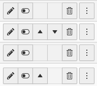
- Remove the disabled buttons - also removes visual noise (either entirely or leave an empty placeholder). In the case of the empty placeholder so that the buttons will not change their position. This is already being done for example in the list module:

see https://typo3.slack.com/archives/C108Q9E2C/p1631517698014400
 Updated by Sybille Peters about 3 years ago
- File pagination_empty_buttons.png pagination_empty_buttons.png added
- Assignee set to Sybille Peters
Screenshots for pagination with empty placeholders:

<core:icon identifier="miscellaneous-placeholder"/>
<core:icon identifier="empty-empty"/>
 Updated by Gerrit Code Review about 3 years ago
- Status changed from New to Under Review
Patch set 1 for branch master of project Packages/TYPO3.CMS has been pushed to the review server.
It is available at https://review.typo3.org/c/Packages/TYPO3.CMS/+/71076
 Updated by Gerrit Code Review about 3 years ago
Patch set 2 for branch master of project Packages/TYPO3.CMS has been pushed to the review server.
It is available at https://review.typo3.org/c/Packages/TYPO3.CMS/+/71076
 Updated by Gerrit Code Review about 3 years ago
Patch set 3 for branch master of project Packages/TYPO3.CMS has been pushed to the review server.
It is available at https://review.typo3.org/c/Packages/TYPO3.CMS/+/71076
 Updated by Sybille Peters about 3 years ago
- Status changed from Under Review to Resolved
- % Done changed from 0 to 100
Applied in changeset c3c3da214d5ab88b0b0c1847f07d66f68300cbdf.