
Feature #95369
open
improve readability of "New Record Selector”
0%
Description
When selecting a new record, it would be nice if the tables would be shown in columns in the backend.
Something like the following:
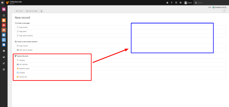
Maybe even in three columns on wide screens.
At the moment we have a pretty large unused space given that the item names are reasonably short.
The positioning of the tables in columns should be responsive of course (they should stack on smaller screens).
Files
 Updated by Georg Ringer over 2 years ago
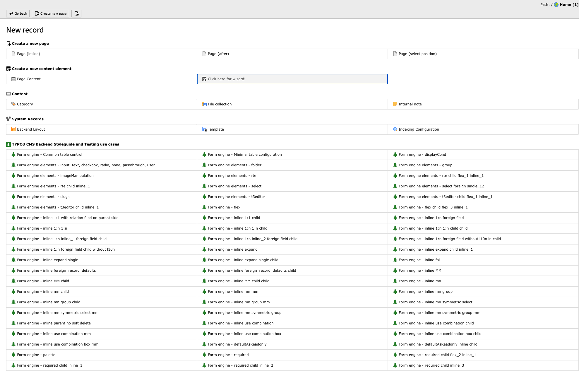
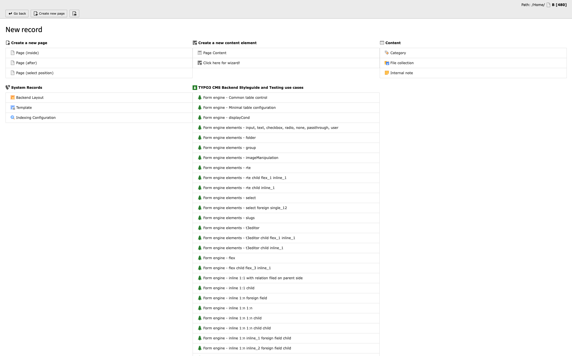
having columns would IMO make it even worse because so hard to read everything. IMO it needs a total new approach because most of the time you only need some specific record types per page. e.g. news + categories in news page, fe_user + groups in a page and nowhere else.
Updated by Georg Ringer over 2 years ago
- Status changed from New to Needs Feedback
 Updated by Michael Schams over 2 years ago
I am not sure what kind of feedback you expect (from me) :-)
I am, of course, also happy with a complete new approach and design suggestion if this makes the "New record" page easier to read and if it eliminates the unnecessary, unused space that I pointed out as an issue in my view. What do you suggest?
(feedback from the community or an UI designer required).
 Updated by Riccardo De Contardi about 2 years ago
- File Schermata 2022-09-18 alle 10.49.11.png Schermata 2022-09-18 alle 10.49.11.png added
- File Schermata 2022-09-18 alle 10.49.20.png Schermata 2022-09-18 alle 10.49.20.png added
@Michael Schams if you agree, I would rename your issue "improve readability of "New Record Selector"", that would be the actual user problem apart from the "emptiness" of the page (Credits given to Rachel Fouchard for pointing me in the right direction ;)).
I agree with @Georg Ringer that rearranging the items on multiple columns could worsen the readability of the lists... I attach a couple of screenshots of what would happen with long lists (these don't cover all scenarios and possibilities, I know)
Updated by Riccardo De Contardi about 2 years ago
- Subject changed from Introduce columns in the "New Record Selector" to improve readability of "New Record Selector”