Actions
Bug #99604
closedSwitch user button not properly aligned in btn-group
Start date:
2023-01-18
Due date:
% Done:
100%
Estimated time:
TYPO3 Version:
12
PHP Version:
Tags:
Complexity:
Is Regression:
Sprint Focus:
Description
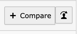
When the switch user component is used in a bootstrap button group, the button is not properly aligned as shown on the screenshot below:

The button should be aligned horizontally with the previous/next button and also have margin-left: -1px;, so the button actually looks grouped with the previous one.
Files
Actions