Actions
Feature #103539
openUX: Backend Page Module - hide CEs buttons and simplify new content buttons to declutter view
Status:
Under Review
Priority:
Should have
Assignee:
-
Category:
Backend User Interface
Target version:
Start date:
2024-04-05
Due date:
% Done:
0%
Estimated time:
PHP Version:
Tags:
UX
Complexity:
Sprint Focus:
Description
The Page Module is cluttered with too many buttons:
- Grid-Columns: new content buttons
- Content Elements: action buttons
New content buttons
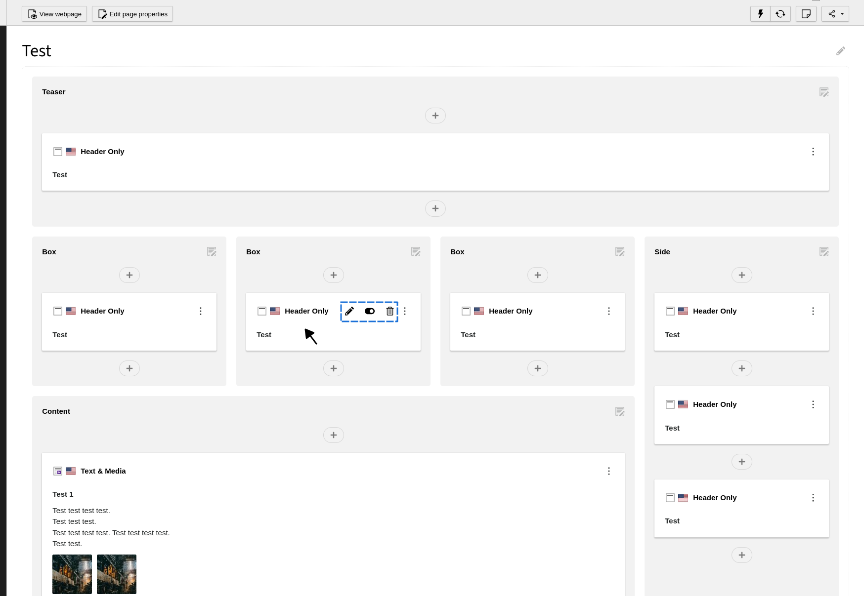
Simplify these buttons to melt into the column-background:- remove box-shadow, round the corners, add opacity etc.
- remove the text 'content'
CEs action buttons
Hide these buttons by default.
Only show the action buttons for the CE that is hovered or has focus right now.
Touch-users can be trained to click on headline/text for editing and use context 3-dot-menu for all other actions.
Preview: hidden CE buttons and simplified new content buttons:

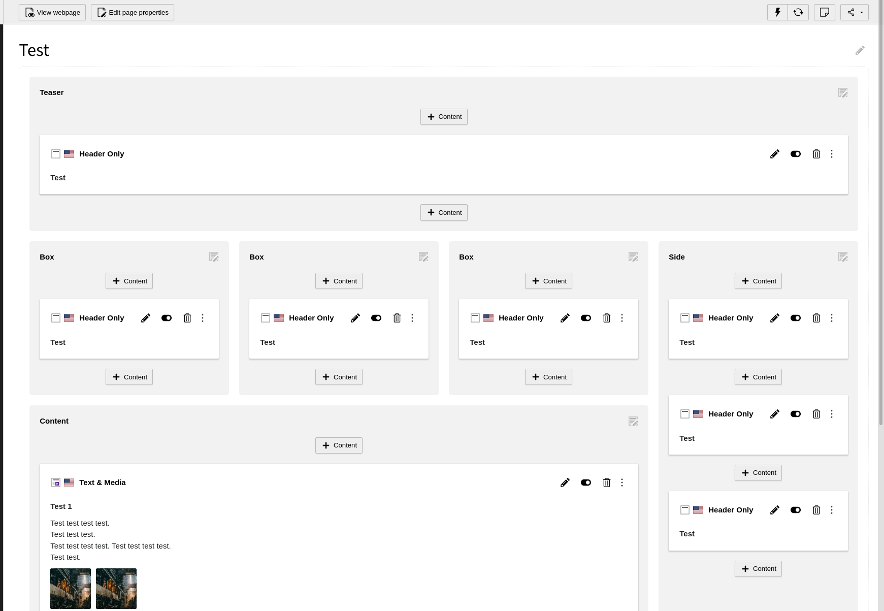
TYPO3 as-is:

Files
Actions