

Feature #3464
closed
Inconsistent icon overlays for start and stop date
100%
Description
Currently the same icon is used for all scheduled states you can produce by filling in the the start and stop fields look the same. We are using different files, but the icons look the same. While in principle you can solve this issue by producing different looking icons there is one issue which can only be resolved by coding.
Editors should be informed about the following three states via different icons:
1) item is currently visible (green clock in screenshot)
2) item is not visible anymore (red clock in screenshot)
3) item will be visible in the future (light green clock in screenshot)
Unfortunately you can only reflect the third state via an icon if both the start and stop date are set to the future, because then the system will use an icon with the suffix '__tf'. But if only the the start date is set to the future, the icon with the suffix __t is shown, means in this case we have the same icon for 'not visible anymore' and 'will be visible in the future'.
Can we perhaps change that behaviour, so that if only the start date is set and the start time is in the future the icon with __tf is shown?
Files
 Updated by Uschi Renziehausen about 15 years ago
Updated by Uschi Renziehausen about 15 years ago
Please note that this issue is currently discussed in the 4.3 project list (search for the thread with the same topic) here are mockups for what the datetimestuff could look. First how it looks right now:
Basically I think that we have to decide about two things separately:
1) Do we want to visualise the three states 'currently visible', 'visible in the future', and outdated.
+1 by Uschi
2) If 1, then which colors those clocks should have:
Solution a (traffic light):
Currently visible = green
Visible in the future = orange
Outdated = red
+1 by Uschi

Solution b:
Currently visible = green
Visible in the future = blue
Outdated = red ;-)")
 Updated by Philipp Gampe about 15 years ago
Uschi Renziehausen wrote:
Basically I think that we have to decide about two things separately:
1) Do we want to visualise the three states 'currently visible', 'visible in the future', and outdated.
+1 by phil
however I still prefer having a blue clock for the future:
Solution b:
Currently visible = green
Visible in the future = blue
Outdated = red
 Updated by Jens Hoffmann almost 15 years ago
- Priority changed from Should have to Could have
-1 Dousn't looks like TYPO3.
Uschi you can't give your self a +1
Phil you are not able to give +1 s
Updated by Jens Hoffmann about 12 years ago
- Category changed from Inconsistency to Design
- Status changed from New to Accepted
- Target version changed from TYPO3 4.3 to TYPO3 6.0
I still think the Idea and the concept is good, just the style is misleading.
Updated by Philipp Gampe about 12 years ago
- File page-types-icons.png page-types-icons.png added
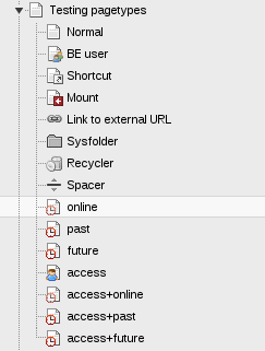
Hi, I added the current icons again.
You can see that there is only one overlay, even if multiple attributes are set.
A page that expired looks the same as one scheduled to be published.
A page online with start and stop date has a light box.
User restriction is only shown if no access restriction is on place.
The icons are two small to fit more than one overlay to it.
Thus we can either reduce the overlays to little dot, making them hard to understand to newcommers,
or we leave it as is, making newcommers wunder why a page is not visible for all users
or we invent new icons (I guess that is not possible or even more confusing)
or we use more than one icon (nogo IMHO) and clutter up the tree
or any further ideas
I still like having different colors for the clocks. This solves at least the issue with the past, online, future access restrictions, but not in combination with fe user group restrictions.
Note: One can always figure out all restrictions by howering over a page icon.
p.s.: funny that I already discussed about this topic two years ago :)
![]()
Updated by Jens Hoffmann about 12 years ago
- Status changed from Accepted to Needs Feedback
We should think about different ways than
Icons, to communicate this information.
 Updated by
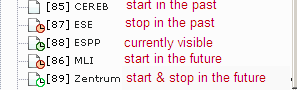
 Updated by Benni Mack almost 8 years ago
- Project changed from 78 to TYPO3 Core
- Category changed from Design to Backend User Interface
- TYPO3 Version set to 8
- Is Regression set to No
 Updated by Alexander Opitz over 7 years ago
- Tracker changed from Bug to Feature
- Status changed from Needs Feedback to New
- Target version set to 9 LTS
Move to Feature for v9
 Updated by Benjamin Kott about 7 years ago
- Status changed from New to Accepted
- Priority changed from Could have to Should have
- Sprint Focus set to On Location Sprint
 Updated by Gerrit Code Review about 7 years ago
- Status changed from Accepted to Under Review
Patch set 1 for branch master of project Packages/TYPO3.CMS has been pushed to the review server.
It is available at https://review.typo3.org/53027
Updated by Gerrit Code Review about 7 years ago
Patch set 2 for branch master of project Packages/TYPO3.CMS has been pushed to the review server.
It is available at https://review.typo3.org/53027
Updated by Gerrit Code Review about 7 years ago
Patch set 3 for branch master of project Packages/TYPO3.CMS has been pushed to the review server.
It is available at https://review.typo3.org/53027
 Updated by Markus Sommer about 7 years ago
- Status changed from Under Review to Resolved
- % Done changed from 0 to 100
Applied in changeset c65d8d109c34df8d8f5cb973123358774758b9ce.
Updated by Gerrit Code Review about 7 years ago
- Status changed from Resolved to Under Review
Patch set 1 for branch TYPO3_8-7 of project Packages/TYPO3.CMS has been pushed to the review server.
It is available at https://review.typo3.org/53055
Updated by Markus Sommer about 7 years ago
- Status changed from Under Review to Resolved
Applied in changeset aae03d2c6d09dc230f4ec5760148494e9f623332.
Updated by Benni Mack almost 6 years ago
- Status changed from Resolved to Closed