

Feature #3464
closed
Inconsistent icon overlays for start and stop date
100%
Description
Currently the same icon is used for all scheduled states you can produce by filling in the the start and stop fields look the same. We are using different files, but the icons look the same. While in principle you can solve this issue by producing different looking icons there is one issue which can only be resolved by coding.
Editors should be informed about the following three states via different icons:
1) item is currently visible (green clock in screenshot)
2) item is not visible anymore (red clock in screenshot)
3) item will be visible in the future (light green clock in screenshot)
Unfortunately you can only reflect the third state via an icon if both the start and stop date are set to the future, because then the system will use an icon with the suffix '__tf'. But if only the the start date is set to the future, the icon with the suffix __t is shown, means in this case we have the same icon for 'not visible anymore' and 'will be visible in the future'.
Can we perhaps change that behaviour, so that if only the start date is set and the start time is in the future the icon with __tf is shown?
Files
 Updated by

 ;-)")
 Updated by
  Updated by
  Updated by
  Updated by
  Updated by
  Updated by
  Updated by
  Updated by
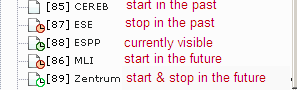