Actions
Bug #86957
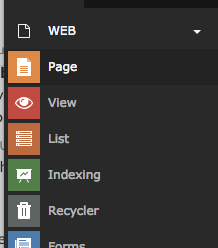
closed'.active'-state background of Backend Modules does not stand out clearly from the background
Status:
Closed
Priority:
Could have
Assignee:
-
Category:
Backend User Interface
Target version:
-
Start date:
2018-11-20
Due date:
% Done:
0%
Estimated time:
TYPO3 Version:
9
PHP Version:
7.2
Tags:
usability,user interface
Complexity:
Is Regression:
Sprint Focus:
Description
We have received criticism from our customers that the color of the active backend module is too dark in 9.5.
This should be more different from the menu.
Currently its a 15% black:
.modulemenu .modulemenu-item.active .modulemenu-item-link {
    background-color: rgba(0,0,0,.15);
}
Maybe a bit more userfriendly is something like a 20% TYPO3 orange ?:
background-color: rgb(244, 151, 0,0.2);
Files
Actions