Actions
Task #89844
closedImprove visual appearance of feature toggles
Status:
Closed
Priority:
Should have
Assignee:
-
Category:
Backend User Interface
Target version:
-
Start date:
2019-12-04
Due date:
% Done:
100%
Estimated time:
TYPO3 Version:
10
PHP Version:
Tags:
Complexity:
Sprint Focus:
Description
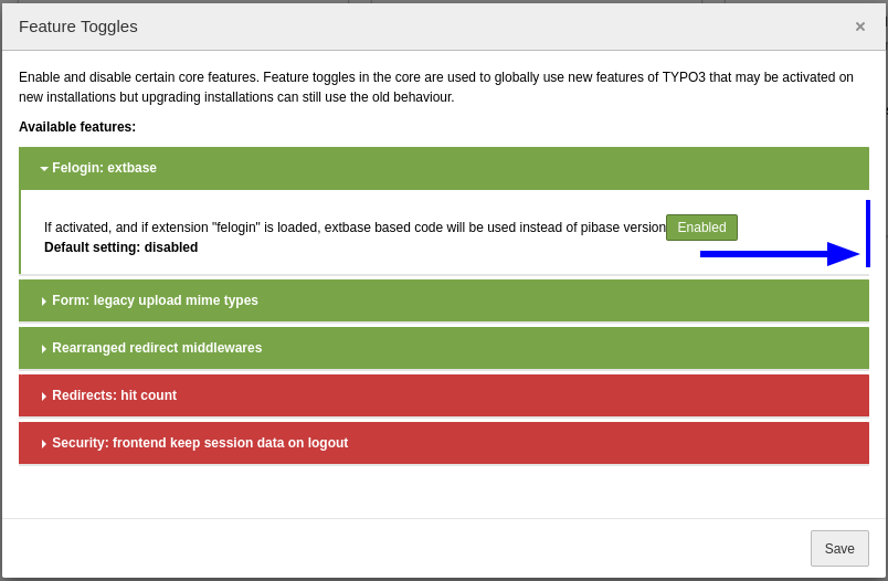
Feature Toggles were introduced in TYPO3 v9.1 (see #83429, ChangeLog, and documentation). The main target audience to use feature toggles are integrators, site administrators, and developers (tech-savvy backend users).
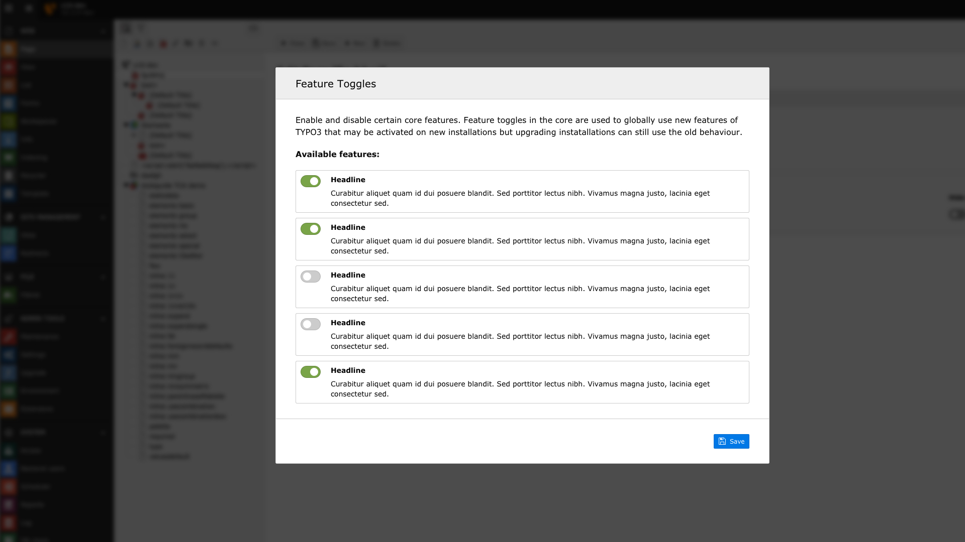
The visual appearance of the UI could (should?) be improved. For example:
- Re-arrange and align the texts and toggle switches.
- Add a headline for each feature.
- Do not show the identifier (e.g.
redirects.hitCount) if not required. - Use nicer switches (other parts of the BE show toggle switches that are more obvious switches).
- Allow for links (e.g. in 10.2 we have the
betaTranslationServerand a link tohttps://crowdin.comwhich is not a<a href="">...</a>tag). - ...
Files
Actions

