Actions
Bug #90824
closedAdd media file - too many options? Confusing ...
Status:
Closed
Priority:
Should have
Assignee:
-
Category:
Backend User Interface
Target version:
-
Start date:
2020-03-24
Due date:
% Done:
0%
Estimated time:
TYPO3 Version:
10
PHP Version:
Tags:
usability, backend, images
Complexity:
Is Regression:
Sprint Focus:
Description
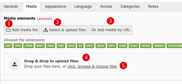
For example in the "textmedia" element "media" tab I have 5 options:
- Add media file
- Select & upload files
- Add media by URL
- Drag and drop to upload files
- or "click, browse and choose files"
While it is cool that you can do several things, there is some overlap.

Option 1 is kind of a mega-dialog where you can also upload files and also use an URL. Why have 2 and 3 if you can already do that in 1?
Option 5 is basically the same as 2.
There may be a reason for doing it this way but it is not immediately intuitively understandable for me.
Once you do click on one of the options, the workflow is pretty simple.
Also the phrasing:
- in option 1 it is "upload media file"
- in option 2 it is just "select & upload files"
In all these cases it is a media file, so I would always use "media file" or just "file". Otherwise you look at the buttons and wonder what is the difference.
Files
Actions