Bug #93739
openUpgrade wizard usability: Confusing labeling of button "Execute" in the case of optional wizards
0%
Description
It may be possible to optimize the GUI and naming of labels.
current problems
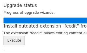
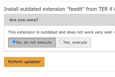
There is no visible hint whether pressing "Execute" will immediately execute the wizard or provide an option to execute it or do not execute it (but mark it as done).

After pressing "Execute"

This may easily result in people never pressing "Execute" and dragging along these upgrade wizards. No huge problem, but I think there is a warning somewhere that appears and tells you that you have an "incomplete upgrade".
Possible solution
Move the 2 options into the list for optional wizards, so that you already choose in the list. So that instead of the "Execute" button you have, for example 2 buttons:
- button: No, do not execute but mark as done
- button: Yes, execute and mark as done
Obviously, the text is a little too long, but could be split up into text within buttons and outside of button.
Related
Change in documentation: https://github.com/TYPO3-Documentation/TYPO3CMS-Guide-Installation/pull/198
Files