
Bug #93898
closed
MFA form should reuse loginHighlightColor for the submit button
100%
Description
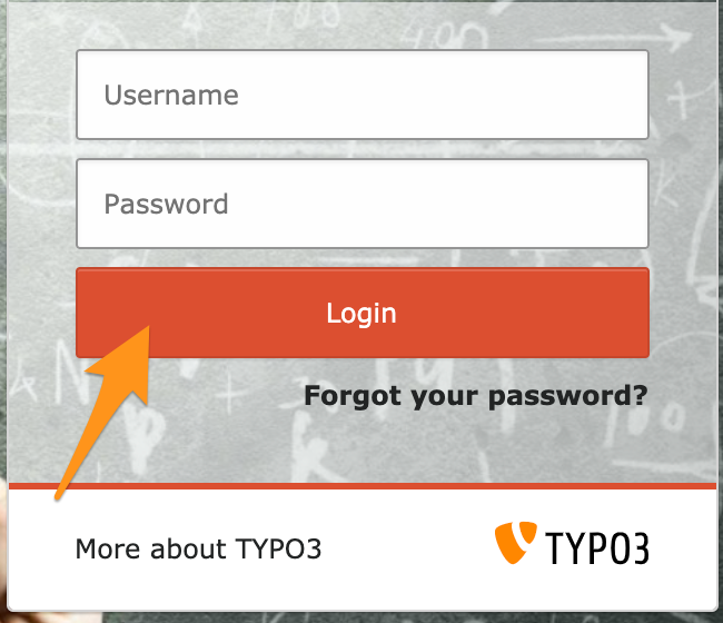
EXT:backend allows to change some parts of the Backend authentication form, typically when defining loginHighlightColor:
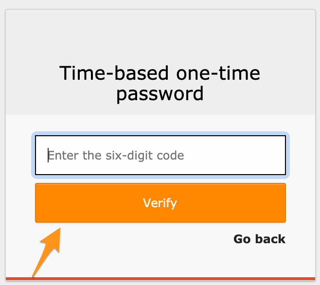
However, when using a MFA such as EXT:mfa_hotp, the 2FA verification form still uses the default orange color:
Expected (at least)
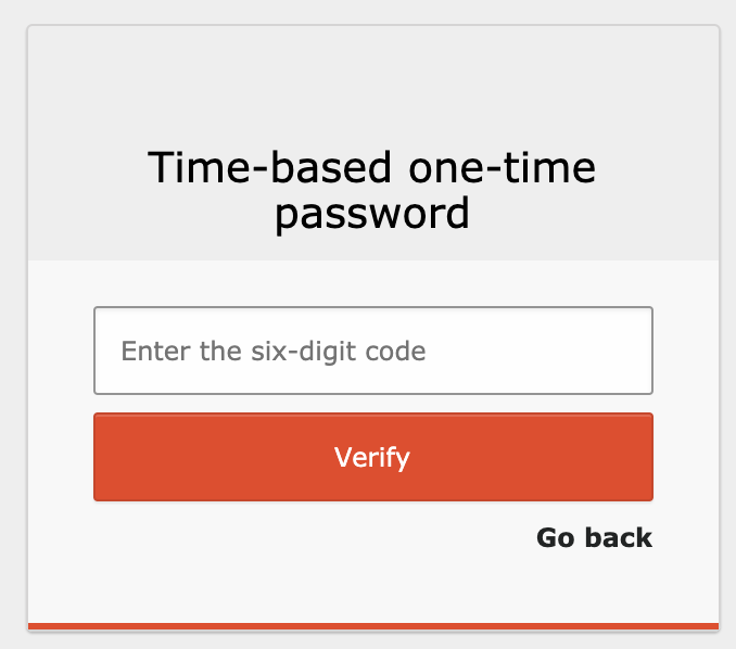
loginHighlightColoris reused so that the submit button is similar to the previous form:
Expected (ideally)
- Reuse of other properties as well, such as the background image (
background-imageon CSS.typo3-login) and logo of the app so that the context stays the same - Possibly add another "mfa" class on the
.card-loginblock so that one can override some styles based on main authentication form or mfa/2fa form - What about keeping the copyright and TYPO3 logo with the card footer? Instead of "More about TYPO3", this could be "More about MFA/2FA", even if logically people reaching this step should know about it already.
Files
 Updated by Xavier Perseguers over 3 years ago
- File preview.png preview.png added
Just so that you see how it could look like if one includes a custom CSS (HTML hacked in browser for the footer, no logo reused on that MFA form) but better consistency in the authentication workflow imho:
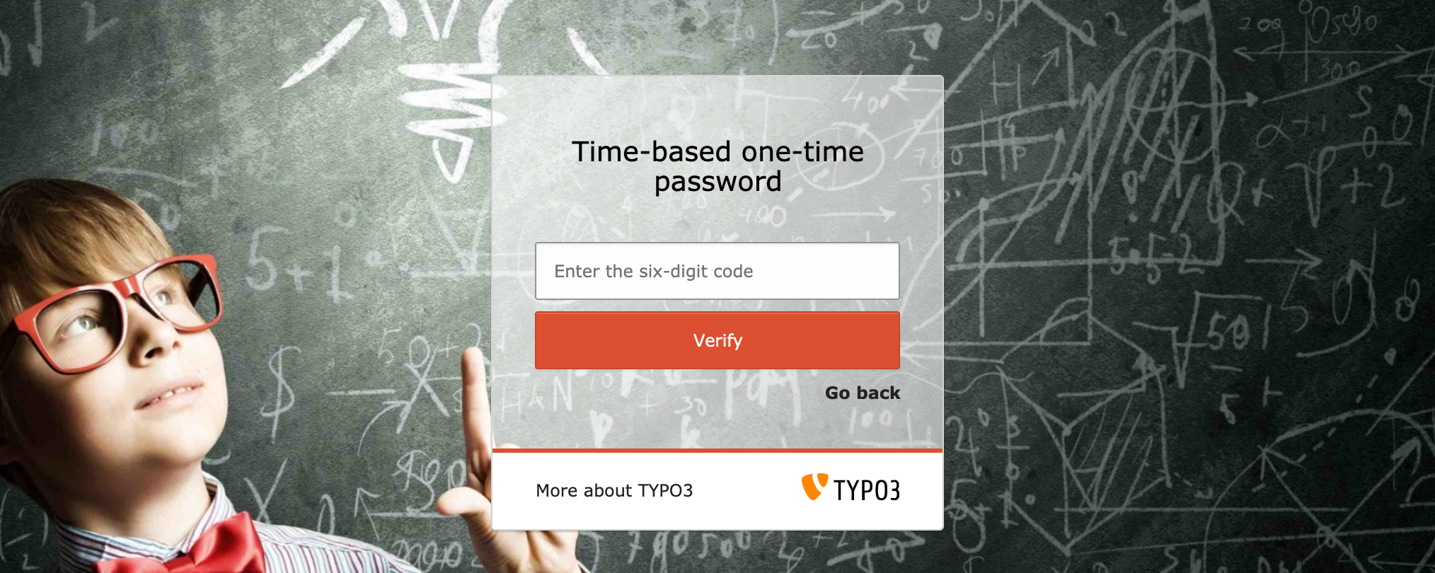
Custom CSS:
.card-login { background-color: inherit; }
.card-login .card-heading { background-color: rgba(255,255,255,.6); }
.card-login .card-body { background-color: rgba(255,255,255,.6); border-bottom-color: #db4f30; }
.card-login .card-footer { background-color: #fff; }
.typo3-login-logo { padding-top: 0; }

/* Needed until https://forge.typo3.org/issues/93898 is fixed: */
#t3-login-submit-section .btn-login { background-color: #db4f30; }
.typo3-login { background-image: url("/typo3conf/ext/my-ext/Resources/Public/Backend/Images/LoginBackground.jpg"); }

/* Unrelated to previous bug but better UX doing that: */
.card-login .card-heading h2.text-center { margin-top: .75rem; }
 Updated by Gerrit Code Review over 3 years ago
- Status changed from New to Under Review
Patch set 1 for branch master of project Packages/TYPO3.CMS has been pushed to the review server.
It is available at https://review.typo3.org/c/Packages/TYPO3.CMS/+/68765
Updated by Gerrit Code Review over 3 years ago
Patch set 2 for branch master of project Packages/TYPO3.CMS has been pushed to the review server.
It is available at https://review.typo3.org/c/Packages/TYPO3.CMS/+/68765
Updated by Gerrit Code Review over 3 years ago
Patch set 3 for branch master of project Packages/TYPO3.CMS has been pushed to the review server.
It is available at https://review.typo3.org/c/Packages/TYPO3.CMS/+/68765
Updated by Gerrit Code Review over 3 years ago
Patch set 4 for branch master of project Packages/TYPO3.CMS has been pushed to the review server.
It is available at https://review.typo3.org/c/Packages/TYPO3.CMS/+/68765
 Updated by Oliver Bartsch over 3 years ago
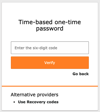
- File alt-providers.png alt-providers.png added
Hi Xavier, thanks for reporting this. You're completely right, MFA should also respect the backend extension configuration.
This however requires to move the current logic from the LoginController into a more general class, which can then also be used in e.g. the MfaController.
Since this is already quite a huge change, I would like to avoid further drive-by changes, so only fixing this bug, without introducing new features.
Nevertheless I would like to take a look at the further suggestions:
Reuse of other properties as well, such as the background image (background-image on CSS .typo3-login) and logo of the app so that the context stays the same
The logo is not used here since the main focus should be on the MFA provider to be used for the additional authentication step. Back then, I actually thought about adding
the MFA providers' logo here as well, but decided against to not unnecessarily overload this view.
Possibly add another "mfa" class on the .card-login block so that one can override some styles based on main authentication form or mfa/2fa form
This seems reasonable but should not be done in this patch, since it's more a feature than a bug.
What about keeping the copyright and TYPO3 logo with the card footer? Instead of "More about TYPO3", this could be "More about MFA/2FA", even if logically people reaching this step should know about it already.
The footer note is now (latest patches) also displayed at the right bottom of the screen. The copyright / TYPO3 logo in the .card-footer is not displayed, since this space is required for the
alternative authentication providers (see screenshot). I furthermore don't thinks this is needed for the additional step. For example, in case you are using mfa_webauthn, the view is only displayed
a few seconds - in case the security key is already inserted.
Are you fine with just fixing the bug (not respecting extension configuration) and adding another ticket for some further improvements of the authentication view?
Updated by Xavier Perseguers over 3 years ago
That's fine with me, as described, my main point was the wrong button color since I customized it, then I've seen the missing footer and everything.
My suggestions for the footer (TYPO3 copyright etc) were just ideas on how to make it look similar than the previous screen, I don't really bother what is actually shown in those areas. But having a "border-bottom" color to separate body from footer card and having no footer doesn't look good :) as long as there's something, like in your example recovery codes, that's fine with me!
Thanks for taking care.
Updated by Oliver Bartsch over 3 years ago
Great, I created the follow-up issue for the improvements here: https://forge.typo3.org/issues/93913.
Updated by Oliver Bartsch over 3 years ago
- Status changed from Under Review to Resolved
- % Done changed from 0 to 100
Applied in changeset 23644892f4ef6cb00c3ebb32689591ad93593961.
 Updated by