Bug #95067
closed
Download button inconsistent
Added by Michael Schams about 3 years ago.
Updated about 3 years ago.
Category:
Backend User Interface
Description
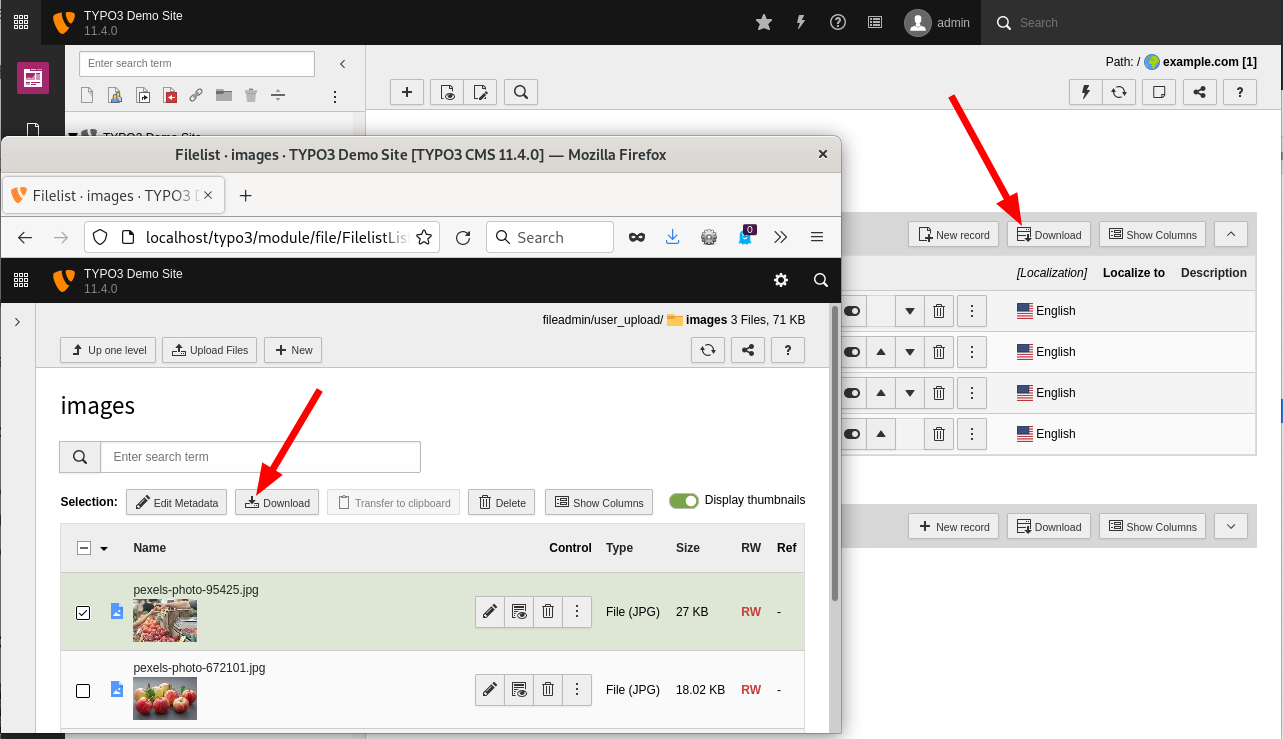
The download button in the table headers in the list view is different from the download button the file list.
Not sure, maybe this is intentionally?

TYPO3 v11.4-dev.
Files
Hi Michael,
yes this is intended.
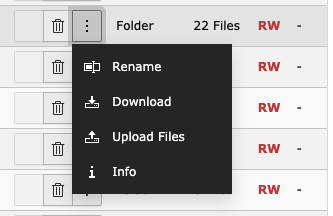
The download icon in the filelist is the default download icon, which is the counterpart to the upload icon:

The icon in the recordlist is the actions-database-export icon, symbolizing that this downloads elements, which are stored in the database.
If you think this is not appropriated, please let me know. Otherwise I would close this issue, if fine for you.
I was confused as the text labels are identical ("Download"). However, if different icons are intended, let's leave it like this and close this ticket.
Thanks for your explanation.
- Status changed from Needs Feedback to Closed
Hello @Michael Schams and thank you for your reply; I close this issue as requested.
If you think that this is the wrong decision please reopen it or ping me and I'll do it.
Thanks.
Also available in: Atom
PDF

