Feature #99424
openEpic #98290: [UX] - Keep the house clean
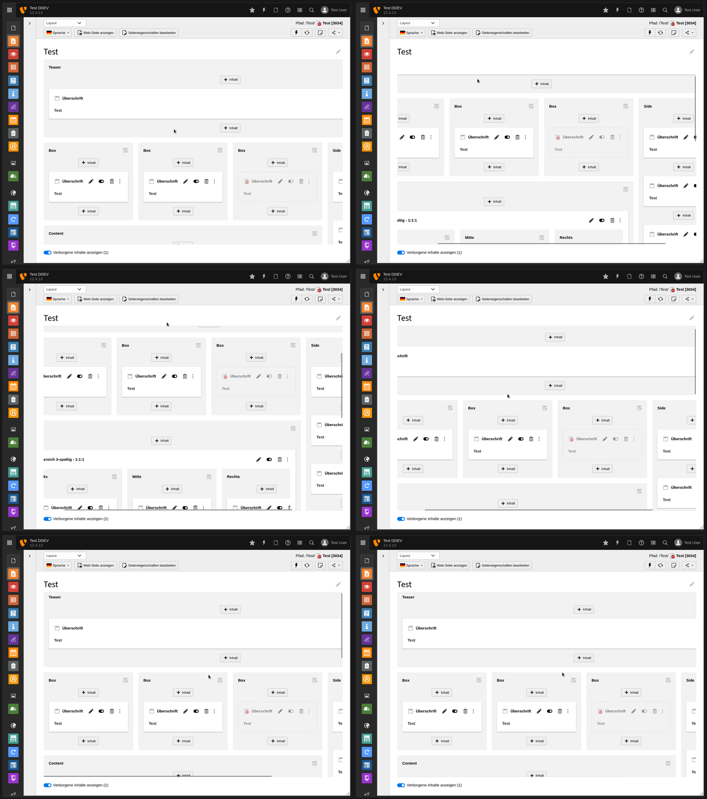
Make always accessible in the the page module's screen the toggles for hidden and unused contents visibility
0%
Description
Hello,
We want the editors stop hidding useless contents instead of deleting them, and cluttering their own working area.
This improvement is splitted in smaller, and if possible, independant patches.
link to the full video (publically accessible): https://drive.google.com/file/d/1cxHaU7JHPiDE1_4hFsfDiM1m2YxfHoLz/view?usp=share_link
This tasks relates to the time 1.07min of the video
It may not be clear enough in the video, but the idea is basically to have the checkboxes in a bottom fixed bar in the screen.
Rachel
Files
 Updated by Annett Jähnichen almost 2 years ago
- Subject changed from Make always accessible in the the page module's screen the toggles for hidden and unused contents visibilty to Make always accessible in the the page module's screen the toggles for hidden and unused contents visibility
 Updated by Annett Jähnichen almost 2 years ago
 Updated by Ayke Halder 7 months ago
See https://forge.typo3.org/issues/97152#note-12
POC: hidden-ce-toggle and scrollbars always visible inside viewport

/* grid-container scrolling behaviour */
.module[data-module-name="web_layout"] {
  display: flex;
  flex-direction: column;
}
.module[data-module-name="web_layout"] > * {
  flex: 0 0 auto;
}
.module[data-module-name="web_layout"] > .module-body {
  flex: 0 1 auto;
  overflow: hidden;
}

.module[data-module-name="web_layout"] .module-body {
  display: flex;
  flex-direction: column;
}
.module[data-module-name="web_layout"] .module-body > * {
  flex: 0 0 auto;
}
.module[data-module-name="web_layout"] .module-body > #PageLayoutController {
  flex: 0 1 auto;
  overflow: hidden;
}

.module[data-module-name="web_layout"] #PageLayoutController {
  display: flex;
  flex-direction: column;

  margin-left: calc((1px + var(--pagemodule-grid-spacing)) * -1);
  margin-right: calc((1px + var(--pagemodule-grid-spacing)) * -1);
}
.module[data-module-name="web_layout"] #PageLayoutController > .t3-grid-container {
  flex: 0 1 auto;
  /* Scrollbars stay always inside visible viewport */
  overflow: scroll;
}
 Updated by Ayke Halder 7 months ago
- Related to Bug #103586: UX: Backend Page Module - horizontal scrollbar added
 Updated by Riccardo De Contardi 4 months ago
· Edited
- File Cattura-pv.PNG Cattura-pv.PNG added
- File Cattura-lv.PNG Cattura-lv.PNG added
- File Cattura-fl.PNG Cattura-fl.PNG added
How about putting a "view" dropdown in the header bar, on the right side? I mean here:
It would be coherent with what happens on both list view
And filelist:
It would be a waste to use a dropdown with just one item inside, but maybe something else could be added in the future.