

Bug #104077
open
disabled icons are hard to differentiate from enabled icons
0%
Description
Hi, I just came around the Info-module and realised that the disabled icons are only slightly different from the active Icons.
They should have more contrast to each other
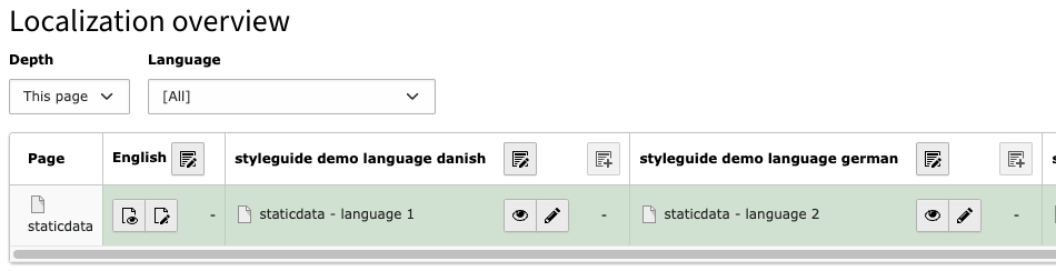
The right icon is the disabled button (the one with the plus-icon inside)
Tested in 13.2.dev and 12.4.14
Files
 Updated by
 Updated by Ayke Halder 5 months ago
Some thoughts on this:
For accessibility (a11y) reasons we MUST keep the contrast ratio icon-to-background at 3:1 or better.
So no further softening possible.
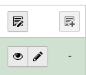
- dashed border-style
- background-color transparent, thereby the button-background becomes identical to the plane it is placed on.
Compare to "Disabled CE":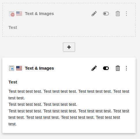
Updated by Ayke Halder 5 months ago
How should disabled buttons in a button group look?
Does the transparent background with dashed border also work there?
 Updated by Rachel Foucard 5 months ago
Hello,
A "disabled button" is not ideal for UX. Even if we manage to agree on how to visually represent button deactivation without having contrast problems, it will probably end to a strange compromise that the user is unlikely to understand.
The dotted line in the page module represents an element that's hidden on the frontend but visible and usable on the backend, it's not the same purpose (and it should also have a better contrast IMO).
An action button is an important interactive element that needs to be as visible as possible. If it's disabled, it's not meant to be used. The best approach is to remove it from the user interface.
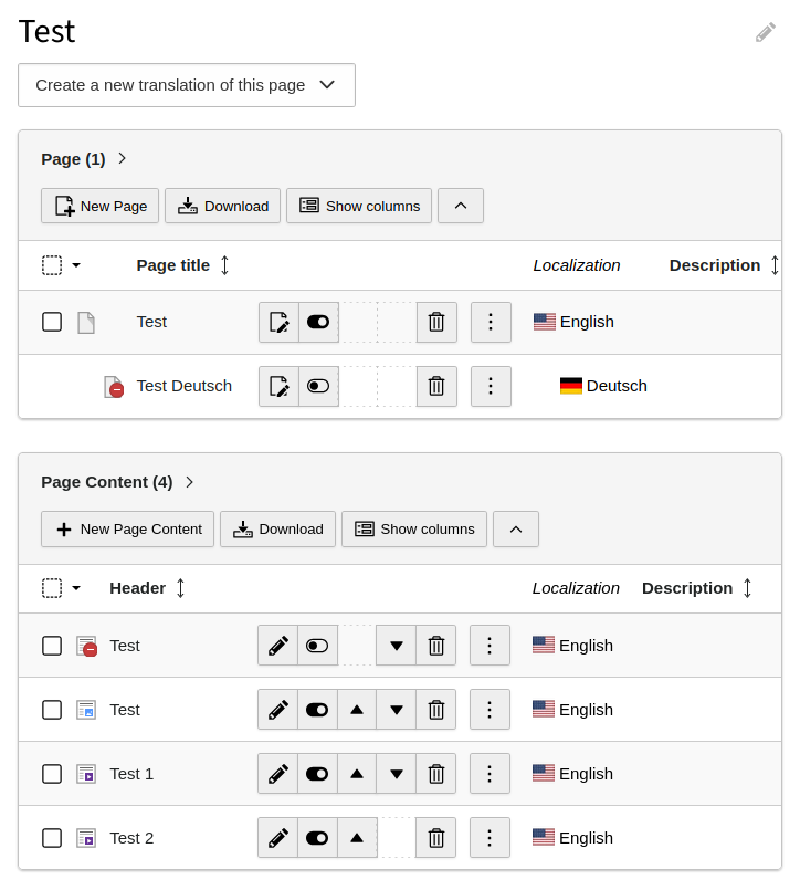
The absence of a button in an interface doesn't bother users who don't even know it exists. Users who are used to seeing a button in a certain location, but who no longer see it in some screens, will of course wonder why the button has disappeared. In that case, keeping the space for the missing button is a very good approach and is enought to tell the user : it is not a bug, it is not you loosing memory, the button is not here for some reasons.
On hovering, if the button is forbidden, the cursor already show a forbidden icon indicating the reason. For the other cases, most of the time, the interface and the situation explain easily why the button is missing. For example, the move-up arrow on the first record and the move-down arrow on the last record are logically missing.
So my recommandation would be to follow what is already in place: remove the button but keep the square in it's position and if the button is missing for permission reasons, tell it.
Rachel
Updated by Ayke Halder 5 months ago
- File typo3-module-info-localization-button-activation.webm typo3-module-info-localization-button-activation.webm added
In this case the button becomes active on user-interaction "checking box":
See video typo3-module-info-localization-button-activation.webm
 Updated by Gerrit Code Review 2 months ago
- Status changed from Accepted to Under Review
Patch set 1 for branch main of project Packages/TYPO3.CMS has been pushed to the review server.
It is available at https://review.typo3.org/c/Packages/TYPO3.CMS/+/85922
Updated by Gerrit Code Review 2 months ago
Patch set 2 for branch main of project Packages/TYPO3.CMS has been pushed to the review server.
It is available at https://review.typo3.org/c/Packages/TYPO3.CMS/+/85922
Updated by Gerrit Code Review 2 months ago
Patch set 3 for branch main of project Packages/TYPO3.CMS has been pushed to the review server.
It is available at https://review.typo3.org/c/Packages/TYPO3.CMS/+/85922
 Updated by Benni Mack about 1 month ago
- Target version changed from 13.3 to Candidate for Major Version
Updated by Gerrit Code Review about 1 month ago
Patch set 4 for branch main of project Packages/TYPO3.CMS has been pushed to the review server.
It is available at https://review.typo3.org/c/Packages/TYPO3.CMS/+/85922