Actions
Task #68793
closedMake DB group fields more intuitive
Status:
Closed
Priority:
Should have
Assignee:
Category:
Backend User Interface
Target version:
Start date:
2015-08-06
Due date:
% Done:
0%
Estimated time:
TYPO3 Version:
7
PHP Version:
Tags:
Complexity:
hard
Sprint Focus:
Description
Scenario
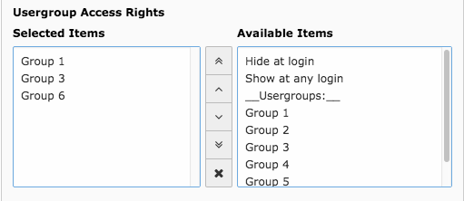
When selecting entries in a DB Group field selected items are moved from the list of available items (right hand side) to the list of selected items (left hand side).
Desired behavior
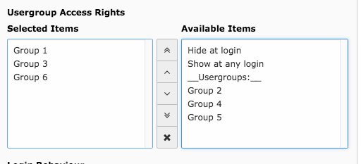
It would be more inuitive if items were "moved" to the left hand side instead of being displayed twice in the form.
it is important to note that DB Group allows to select items multiple times (so they show up multiple times on the left hand side) in which case the current behavior is intended.
Screens
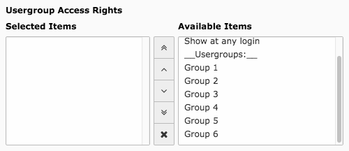
Initial State
Current state
Desired state
Files
 Updated by Riccardo De Contardi almost 9 years ago
- Category set to Backend User Interface
- Target version set to Candidate for Major Version
Actions