Bug #98354
opencolClear for colums in TCA palettes with numberOfItems > 4
0%
Description
I had 7 fields of type checkbox within a palette. The items have been arranged in two columns - but why?
The calculation is done in \TYPO3\CMS\Backend\Form\Container\PaletteAndSingleContainer::renderInnerPaletteContent() by `$colWidth = (int)floor(12 / $numberOfItems);`.
Let's calculate some values:
numberOfItems: 1 - colWidth: 12
numberOfItems: 2 - colWidth: 6
numberOfItems: 3 - colWidth: 4
numberOfItems: 4 - colWidth: 3
numberOfItems: 5 - colWidth: 2
numberOfItems: 6 - colWidth: 2
numberOfItems: 7 - colWidth: 1
numberOfItems: 8 - colWidth: 1
numberOfItems: 9 - colWidth: 1
numberOfItems: 10 - colWidth: 1
numberOfItems: 11 - colWidth: 1
numberOfItems: 12 - colWidth: 1
For all $numberOfItems > 4, you'll get $colWidth <= 2 with results in CSS classes "col-sm-6 col-md-3 col-lg-2". For large screens we'll have 6 columns.
But ... There's a logic for 'colClear'-elements, too. These are inserted (for $colWidth <= 2) after each second, fourth and sixth item. With these clearers the behavior of colWidth brakes: e.g. 7 items are arranged in 6 columns, each with width 16,77%, but due to the colClear-elements the output is only two-columned.
I'm not sure if it's really a bug, because someone obviously gave some thought to the introduction of the colClear elements, but I see potential for optimization.
Tested in TYPO3 v11. Code seems unchanged in v12/master
Files
 Updated by Markus Klein almost 2 years ago
Maybe our attempt https://review.typo3.org/c/Packages/TYPO3.CMS/+/76877 is a possible way to go?
 Updated by Garvin Hicking 5 months ago
- Category set to Backend User Interface
- Status changed from New to Needs Feedback
- Tags set to responsive, ux
- Sprint Focus set to Needs Decision
The behaviour is the same for v13. I guess for that many elements, having a two-column grid was meant to not be overwhelmed by the items and support a simpler "list view" for the human eye.
Maybe the UX team wants to weigh in.
(Markus' patch can still apply to v13main and only needs a minor merge conflict resolve, but honestly I don't feel like having that many checkboxes/input elements next to each other is visually appealing...?)
 Updated by Julian Hofmann 5 months ago
However, more than 4 checkboxes quickly result - especially with (customer-specific) data records.
Think, for example, of allergens contained in food, the topping of a pizza, properties of a property,...
Yes, it is possible to pack all these properties into separate fields. But then their (joint) filtering becomes more complex - and whether the UX in the backend would be better is questionable.
 Updated by Garvin Hicking 5 months ago
Wouldn't for this usecase a category tree be more helpful and workable? Or a custom rendertype even, arranging it exactly as needed?
 Updated by Julian Hofmann 5 months ago
A category tree requires a tree-like data structure. Checkboxes are at the same level.
A separate rendertype would also be a solution, yes, maybe.
Nevertheless, I question the formatting behavior of the core. In my opinion, it is broken - regardless of whether more than 4 checkboxes “make sense”.
SummaryFor all $numberOfItems > 4, you'll get $colWidth <= 2 with results in CSS classes "col-sm-6 col-md-3 col-lg-2". For large screens we'll have 6 columns.
But ... There's a logic for 'colClear'-elements, too. These are inserted (for $colWidth <= 2) after each second, fourth and sixth item. With these clearers the behavior of colWidth brakes: e.g. 7 items are arranged in 6 columns, each with width 16,77%, but due to the colClear-elements the output is only two-columned.
- If a two-column layout is forced (via `colClear`), then the full width should still be used (i.e. 50% per item).
- Or - if you set the 16.77% width per item - a corresponding number of items should be arranged next to each other.
 Updated by Garvin Hicking 5 months ago
- Status changed from Needs Feedback to New
Julian Hofmann wrote in #note-5:
A category tree requires a tree-like data structure. Checkboxes are at the same level.
I was thinking about your idea with the pizza toppings, allergens, etc - these could all be attributes specified in a tree, but sorry if I misstepped.
Nevertheless, I question the formatting behavior of the core. In my opinion, it is broken - regardless of whether more than 4 checkboxes “make sense”.
OK! I'll leave this ticket as "Needs decision" for someone of the Backend UI/UX/Accessibility-Team, thanks for elaborating!
 Updated by Armin Vieweg 4 months ago
· Edited
I've also recognized this behavior and think that it is not intended to interrupt the grid system with clearfixes, this way.
I think this is a relict from migration to Bootstrap.
In my opinion, the clearfixes should get removed entirely, because Bootstrap Grids doesn't work like that.
Also, it would be possible to add "col" class only for every field in palette, the Bootstrap grid will choose and align the size of each column on its own. This would also make the current calculation of column size obsolete.
For --linebreak-- a new row should be added, instead of using "dirty" clearfix.
 Updated by Gerrit Code Review 3 months ago
- Status changed from New to Under Review
Patch set 1 for branch main of project Packages/TYPO3.CMS has been pushed to the review server.
It is available at https://review.typo3.org/c/Packages/TYPO3.CMS/+/85556
 Updated by Armin Vieweg 3 months ago
- File clipboard-202408081428-bsfm6.png clipboard-202408081428-bsfm6.png added
- File clipboard-202408081429-7tstp.png clipboard-202408081429-7tstp.png added
- File clipboard-202408081429-nztlq.png clipboard-202408081429-nztlq.png added
- File clipboard-202408081429-isoe9.png clipboard-202408081429-isoe9.png added
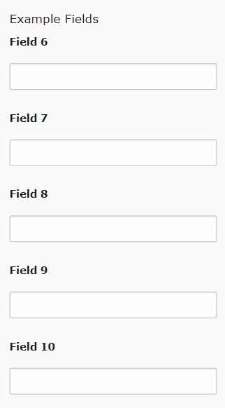
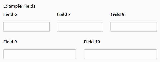
With the patch, palette fields behave like this:


The space behind "Field 10" happens, because of defined max-width in every form field.

 Updated by Gerrit Code Review about 1 month ago
Patch set 2 for branch main of project Packages/TYPO3.CMS has been pushed to the review server.
It is available at https://review.typo3.org/c/Packages/TYPO3.CMS/+/85556
 Updated by Gerrit Code Review 24 days ago
Patch set 3 for branch main of project Packages/TYPO3.CMS has been pushed to the review server.
It is available at https://review.typo3.org/c/Packages/TYPO3.CMS/+/85556
 Updated by Gerrit Code Review 19 days ago
Patch set 4 for branch main of project Packages/TYPO3.CMS has been pushed to the review server.
It is available at https://review.typo3.org/c/Packages/TYPO3.CMS/+/85556
 Updated by Garvin Hicking 19 days ago
- File Screenshot 2024-11-02 at 11.09.08.png Screenshot 2024-11-02 at 11.09.08.png added
- File Screenshot 2024-11-02 at 11.10.44.png Screenshot 2024-11-02 at 11.10.44.png added
Screenshots of EXT:styleguide example
With patch:
!Screenshot 2024-11-02 at 11.09.08.png!
Without patch:
!Screenshot 2024-11-02 at 11.10.44.png!
 Updated by Gerrit Code Review 16 days ago
Patch set 5 for branch main of project Packages/TYPO3.CMS has been pushed to the review server.
It is available at https://review.typo3.org/c/Packages/TYPO3.CMS/+/85556
 Updated by Gerrit Code Review 14 days ago
Patch set 1 for branch main of project Packages/TYPO3.CMS has been pushed to the review server.
It is available at https://review.typo3.org/c/Packages/TYPO3.CMS/+/86918
 Updated by Gerrit Code Review 14 days ago
Patch set 6 for branch main of project Packages/TYPO3.CMS has been pushed to the review server.
It is available at https://review.typo3.org/c/Packages/TYPO3.CMS/+/85556
 Updated by Gerrit Code Review 14 days ago
Patch set 7 for branch main of project Packages/TYPO3.CMS has been pushed to the review server.
It is available at https://review.typo3.org/c/Packages/TYPO3.CMS/+/85556
 Updated by Gerrit Code Review 13 days ago
Patch set 8 for branch main of project Packages/TYPO3.CMS has been pushed to the review server.
It is available at https://review.typo3.org/c/Packages/TYPO3.CMS/+/85556