Task #102978
open
EXT:form Improvement: Do not render pencil Icons for forms that are not editable
Added by Daniel Goerz 10 months ago.
Updated about 1 month ago.
Description
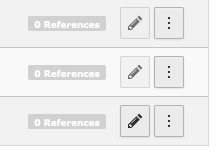
In the backend module "Forms", editable and uneditable forms both have a pencil icon rendered in the action button. For uneditable forms the button is a disabled with the pencil beeing mildly opaque. This is very hard to see:

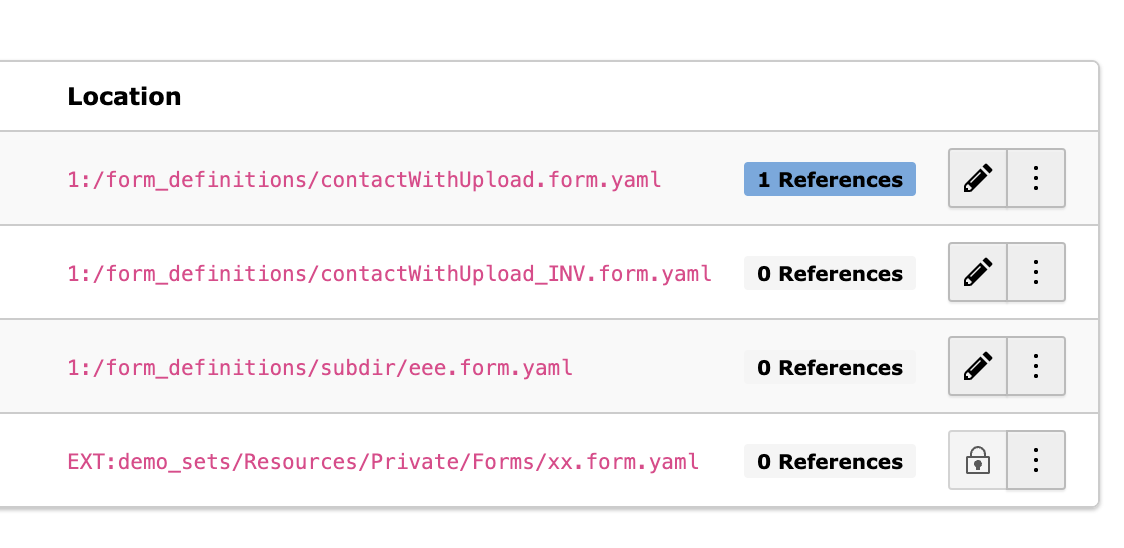
So for locked forms, that are not editable, we should use a different icon instead. For example the lock icon.
Files
- Related to Feature #102979: EXT:form Improvement: Make list of forms filterable added
- Related to Feature #102865: Add PSR-14 Event to modify loaded form definition added
- Related to Feature #103266: EXT:form Improvement: Introduce Possibility for Validators at form level added
- Related to Feature #103267: EXT:form Improvement: Field identifier should be editable added

how it looks now
- Status changed from New to Under Review
Hi,
I'm not quite sure about the lock icon.
In most places in the backend (list module) we render an empty field or the button not at all instead of a disabled button.
Maybe that would be the better option here?
Annett Jähnichen wrote in #note-7:
Hi,
I'm not quite sure about the lock icon.
In most places in the backend (list module) we render an empty field or the button not at all instead of a disabled button.
Maybe that would be the better option here?
I think "render an empty field or the button not at all" would also be a great improvement.
Also available in: Atom
PDF
