
Bug #24327
closed
Usability: "edit group" icon in FormEngine / user admin at the wrong place
0%
Description
The "User Admin" interface has a usability problem regarding the "edit group" icon (the pencil).
The pencil is placed next to the right list, while you are expected to select the group you want to edit in the left list. That's highly confusing.
I'm using Typo3 since years, and it still happens to me that I select a group in the right list (next to the pencil) and then get a "Please select one or more items in the list before you can edit" message. I guess new users see this message even more often.
Proposal: move the pencil icon next to the left list. This should "tell" the users that they have to select the group to edit in the left list.
The attached picture shows a mockup of what I mean.
(issue imported from #M16730)
Files
 Updated by Steffen Gebert over 13 years ago
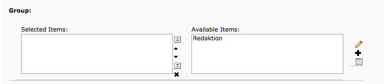
I agree, the rendering of the TCEforms seems to be really bad that the icon is shown right of the right list, although it works for the left list.
 Updated by Alexander Opitz over 10 years ago
- Category set to Backend User Interface
- Target version deleted (
0) - Is Regression set to No
 Updated by Felix Kopp over 9 years ago
- File Bildschirmfoto 2014-10-19 um 22.50.55.png Bildschirmfoto 2014-10-19 um 22.50.55.png added
- Subject changed from Usability: "edit group" icon in user admin at the wrong place to Usability: "edit group" icon in FormEngine / user admin at the wrong place
- Status changed from New to Resolved
 Updated by Christian Boltz over 9 years ago
This is not resolved - your screenshot clearly shows that the "edit" icon is still at the wrong place.
Please reopen this bug (it seems I don't have permissions to do it myself)
 Updated by
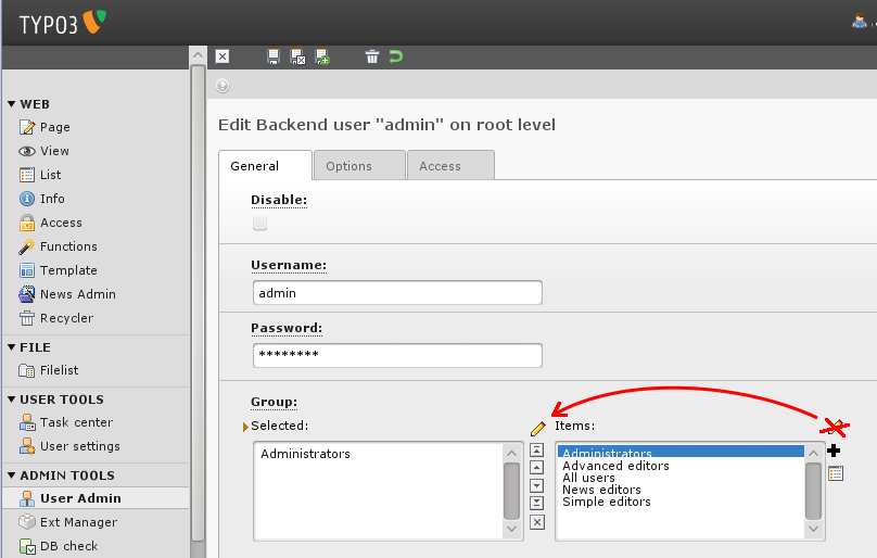