
Actions
Bug #24327
closed
Usability: "edit group" icon in FormEngine / user admin at the wrong place
Status:
Closed
Priority:
Should have
Assignee:
-
Category:
Backend User Interface
Target version:
-
Start date:
2010-12-12
Due date:
% Done:
0%
Estimated time:
TYPO3 Version:
4.5
PHP Version:
Tags:
Complexity:
Is Regression:
No
Sprint Focus:
Description
The "User Admin" interface has a usability problem regarding the "edit group" icon (the pencil).
The pencil is placed next to the right list, while you are expected to select the group you want to edit in the left list. That's highly confusing.
I'm using Typo3 since years, and it still happens to me that I select a group in the right list (next to the pencil) and then get a "Please select one or more items in the list before you can edit" message. I guess new users see this message even more often.
Proposal: move the pencil icon next to the left list. This should "tell" the users that they have to select the group to edit in the left list.
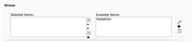
The attached picture shows a mockup of what I mean.
(issue imported from #M16730)
Files
 Updated by
  Updated by
  Updated by
  Updated by
  Updated by
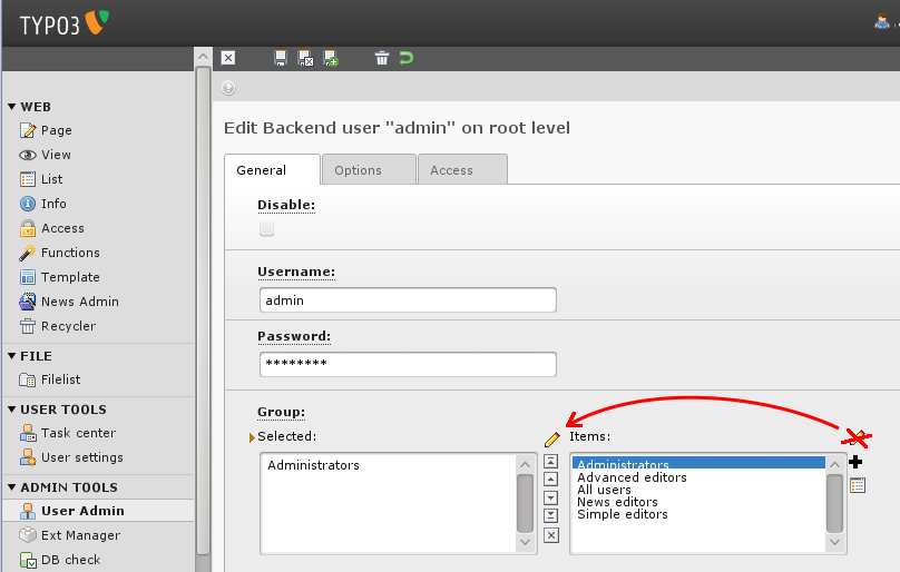
Actions