Bug #102331
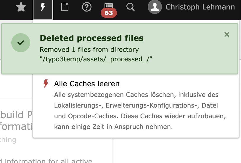
closedz-index: Clear cache menu is hidden by flash messages.
100%
Description
A flash message should not hide the clear cache menu.

Files
 Updated by Andreas Kienast about 1 year ago
Personally, I think it's fine the way it is. Flash messages are temporary and disappear after a few seconds, unless it's an error. I'll redirect this to the UX team.
 Updated by Rachel Foucard about 1 year ago
Hello,
the flash message z-index is good, because it's supposed to be hover anything in the interface, but it's probably the position in the screen that is unusual, and cause this situation. Usually, a flash message or snackbar should stand at the bottom / right of the screen. With a bottom position, it is easy to see and to interact, and it is less likely to interfere with important menus or actions.
Rachel
 Updated by Gerrit Code Review about 1 year ago
- Status changed from New to Under Review
Patch set 1 for branch main of project Packages/TYPO3.CMS has been pushed to the review server.
It is available at https://review.typo3.org/c/Packages/TYPO3.CMS/+/81728
 Updated by Marcin Sągol about 1 year ago
I have proposed patch, where the alert container is rendered centered. You can test it.
In my opinion it might be better than having it aligned to the upper right corner.
There was also this topis here: https://ux.stackexchange.com/questions/39265/placement-of-flash-growl-notifications-or-messages-in-web-application
 Updated by Gerrit Code Review about 1 year ago
Patch set 2 for branch main of project Packages/TYPO3.CMS has been pushed to the review server.
It is available at https://review.typo3.org/c/Packages/TYPO3.CMS/+/81728
 Updated by Gerrit Code Review about 1 year ago
Patch set 3 for branch main of project Packages/TYPO3.CMS has been pushed to the review server.
It is available at https://review.typo3.org/c/Packages/TYPO3.CMS/+/81728
 Updated by Rachel Foucard about 1 year ago
Hello Marcin,
Thank you for working on this patch.
Centering the alert container won't solve the problem because other important action button will be hidden according the screen size. A lot of important action buttons or menu are generaly on the top of a screen.
Usually, a flash message or snackbar should stand at the bottom of the screen (bottom / right for large screen, and bottom / center for mobile screen).
Rachel
 Updated by Gerrit Code Review about 1 year ago
Patch set 4 for branch main of project Packages/TYPO3.CMS has been pushed to the review server.
It is available at https://review.typo3.org/c/Packages/TYPO3.CMS/+/81728
 Updated by Gerrit Code Review about 1 year ago
Patch set 5 for branch main of project Packages/TYPO3.CMS has been pushed to the review server.
It is available at https://review.typo3.org/c/Packages/TYPO3.CMS/+/81728
 Updated by Gerrit Code Review about 1 year ago
Patch set 6 for branch main of project Packages/TYPO3.CMS has been pushed to the review server.
It is available at https://review.typo3.org/c/Packages/TYPO3.CMS/+/81728
 Updated by Marcin Sągol about 1 year ago
- Status changed from Under Review to Resolved
- % Done changed from 0 to 100
Applied in changeset ff09345bf6691af7c154875f59a0fb52dd0e74d7.
 Updated by Andreas Kienast almost 1 year ago
- Related to Bug #102459: Moved notification may break AC tests added
 Updated by Gerrit Code Review almost 1 year ago
- Status changed from Resolved to Under Review
Patch set 1 for branch 12.4 of project Packages/TYPO3.CMS has been pushed to the review server.
It is available at https://review.typo3.org/c/Packages/TYPO3.CMS/+/81897
 Updated by Gerrit Code Review almost 1 year ago
Patch set 2 for branch 12.4 of project Packages/TYPO3.CMS has been pushed to the review server.
It is available at https://review.typo3.org/c/Packages/TYPO3.CMS/+/81897
 Updated by Gerrit Code Review almost 1 year ago
Patch set 3 for branch 12.4 of project Packages/TYPO3.CMS has been pushed to the review server.
It is available at https://review.typo3.org/c/Packages/TYPO3.CMS/+/81897
 Updated by Marcin Sągol 12 months ago
- Status changed from Under Review to Resolved
Applied in changeset d431b08a3e2bf761bc7edea99c0c2ee522fbd1e3.
 Updated by Riccardo De Contardi 11 months ago
- Related to Bug #102691: Notifications now appear from bottom right instead of top right added
 Updated by Ayke Halder 4 months ago
- Related to Bug #104566: Closing notification message has movement on close animation added