Bug #27592
closed
Scheduler: Add new button and Save button
Added by Lorenz Ulrich over 13 years ago.
Updated almost 11 years ago.
Description
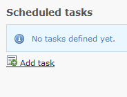
The "Add new" button has an ugly styling:

The save/cancel buttons are closer to "Server time" than to the form they're affecting:

Files
buttons should be moved to top toolbar (to be consistent!)
- Tracker changed from Suggestion to Bug
- Project changed from 1522 to 78
Can you add a bigger Screenshot?
I don't get the full thing here.
Please :)
bigger screen shots attached


- Category set to Inconsistency
- Status changed from New to Accepted
- Priority changed from Should have to Must have
- Target version set to TYPO3 4.6
Now I could get it :) Agree!
BTNs should be at the top.
Who could fix that?
Please move to the Scheduler project (subproject of Core).
buttons should be in topbar as in all modules!
- Project changed from 78 to 739
- Category deleted (
Inconsistency)
- Target version deleted (
TYPO3 4.6)
This is already committed and thus this bug can be closed.
In which version? Is there some duplicate bug report (yes, I'm lazy, I could search ;-) )?
It is #35104 which by the way also needs to be closed.
- Status changed from Accepted to Closed
Resolved in duplicate issue.
- Category set to scheduler
- Project changed from 739 to TYPO3 Core
- Category changed from scheduler to scheduler
Also available in: Atom
PDF


