Feature #27606
closedRebrush un-do / history view
0%
Description

Files
 Updated by Kay Strobach over 13 years ago
agree dislike them as well ;)
 Updated by Steffen Gebert over 13 years ago
- Tracker changed from Support to Feature
- Project changed from 1522 to 78
 Updated by Jens Hoffmann over 13 years ago
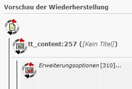
Tango Icon set is ugly! NOGO!
- We do we need to big icons?
- Can't we go for default TYPO3 icons instead? The user would than know what they are meaning.
- We should replace the icon (with a BTN behind) to a Icon+BTN for a clear CTA.
BTW: The whole UX of that Module is horror :)
But to change the icons would be a good starting point.
 Updated by Steffen Gebert over 13 years ago
Would be great, if you or Lars could provide an improved UI.
 Updated by Jens Hoffmann over 13 years ago
- Category set to Usability
- Status changed from New to Accepted
- Assignee set to Jens Hoffmann
First he would need a concept Sketch for the UX behind the UI.
Maybe, Steffen, we could work that out at T3DD11? :)
 Updated by Steffen Gebert over 13 years ago
Yes, of course. Although I don't know the total power of this module, we should give it a try. For me it's also always a trial-and-error process of restoring changes.
 Updated by Felix Kopp about 10 years ago
- Subject changed from New icons for undo actions? to Rebrush un-do / history view
 Updated by Benni Mack about 8 years ago
- Project changed from 78 to TYPO3 Core
- Category changed from Usability to Backend User Interface
 Updated by Riccardo De Contardi over 4 years ago
I have to add that since version 7 the the "cycles" icons have been replaced by text labels.
 Updated by Christian Kuhn almost 2 years ago
- Status changed from Accepted to Closed
Hey. I hope it's ok to close here for now: The history module is still a ux nightmare, however, work on this should be done with fresh issues.