Feature #27606
closed
- Tracker changed from Support to Feature
- Project changed from 1522 to 78
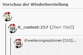
Tango Icon set is ugly! NOGO!
- We do we need to big icons?
- Can't we go for default TYPO3 icons instead? The user would than know what they are meaning.
- We should replace the icon (with a BTN behind) to a Icon+BTN for a clear CTA.
BTW: The whole UX of that Module is horror :)
But to change the icons would be a good starting point.
Would be great, if you or Lars could provide an improved UI.
- Category set to Usability
- Status changed from New to Accepted
- Assignee set to Jens Hoffmann
First he would need a concept Sketch for the UX behind the UI.
Maybe, Steffen, we could work that out at T3DD11? :)
Yes, of course. Although I don't know the total power of this module, we should give it a try. For me it's also always a trial-and-error process of restoring changes.
- Subject changed from New icons for undo actions? to Rebrush un-do / history view
- Project changed from 78 to TYPO3 Core
- Category changed from Usability to Backend User Interface
I have to add that since version 7 the the "cycles" icons have been replaced by text labels.
- Status changed from Accepted to Closed
Hey. I hope it's ok to close here for now: The history module is still a ux nightmare, however, work on this should be done with fresh issues.
Also available in: Atom
PDF
