Feature #53941
closed
UX: Multi-edit records looks ugly
0%
Description
TCEforms has the so called "multi-record-edit" view, where you can edit the same set of fields for multiple records at once.
This can be reached from the Web>List view and you can even select which records to edit (by using Clipboard 1 or 2) and which records to edit (by enabling them in the List-view and clicking on the header "Edit" icon.
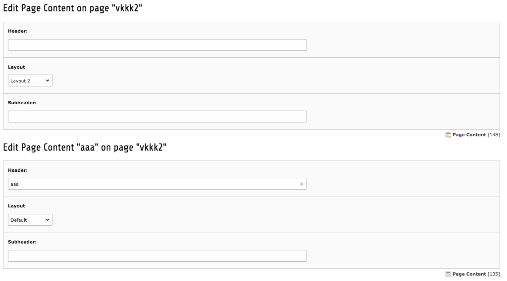
Now if you select only certain fields, this editing interface looks really ugly (see attached screen typo3-multi-edit.png).
The UX Team also noted that. The suggested solutions are documented here:
https://projects.invisionapp.com/share/H2IU7YVE#/screens/10259939/comments/6159748
Basically:
a) do not use multiple "H1" headers, instead have a single H1 header on top ("Edit Page Content on page "ab") and separate smaller H2 between the elements ("Page Content "xy").
Note that there is no GUI for editing individual fields of multiple records that spawn across multiple sites, only by using the "Edit" icons in the Web>List view in the table headers. So in this case you can be sure that you only have the same record type and the same page.
b) the frame that usually surrounds TCEform editing areas is not visible. By re-adding this, it would most probably group the editing in a more intuitive way.
Files
 Updated by
  Updated by
  Updated by
  Updated by
  Updated by
  Updated by
  Updated by