Bug #97152
openUsability problem in listings: horizontal scrollbar not visible initially
0%
Description
In the list of reference (opened via the file list) you must scroll down to see the edit action buttons if the visible content is too wide.
There is a horizontal scrollbar on the bottom, so there is a way to reach the clipped off content.
This is only a bother, if there are lots of entries and you don't see the scrollbar and you either have to scroll down and back up (or you are not aware there is a scrollbar and not aware there is more content).
Problems
- have to scroll down or know how to scroll horizontally to reach action buttons to edit
inconsistency: e.g. in redirects module, you can also click on "Source Path" to edit, in the list of references you can only edit by clicking on the button- instead of using the action buttons, it is possible to click on the icon or the title, but this behaviour is also a bit hidden because the links (in the Backend in general) are not styled as links, only visible as links on hover and you have to hover exactly over the text or icon - not the entire area, see comment http://forge.typo3.org/issues/97152#note-16
Reproduce
Intention: we want to see a list of references for a file and make changes in a (related) content element.
- Use latest main branch with styleguide
- Let styleguide create content
- In file list click on fileadmin/styleguide and choose a file, e.g. bus_lane.jpg and click on the "Ref" link (right column)
- When scrolling down we see the "References to this item"
The content is clipped, we do not see the action buttons. We must scroll down to do that to get to the horizontal scrollbar.
The problem exists due to the following. Some of these are a question of general BE UI concept.
- It is not possible to resize the dialog (this is generally so, so it complies to general BE UI concept)
- In some other dialogs in the BE, in addition to the action icons on the far right, you can also click on a link in the columns. This is the case in the redirects module, for example. You can edit by clicking on source_path column. I do not find this intuitive, but in cases like these it would be helpful
- The clipping of tables can be prevented by setting a fixed size (e.g. done in linkvalidator list). But in most other cases, it is not done, so you do get the scrollbar.
- The action buttons are on the far right and in combination with above can be clipped easily. This complies to general BE UI concept (also mentioned in styleguide extension).
Example 1: Listing of references

After scrolling down:

Example 2: redirects module

Here, there is also a horizontal scrollbar and content is cut off, but you can edit by clicking on the link in "Source path" column (not really intuitive because no visible indication what the link does).
Files
 Updated by Sybille Peters over 2 years ago
- Related to Bug #93912: Avoid horizontal scrollbar for redirects module added
 Updated by Sebastian Michaelsen 8 months ago
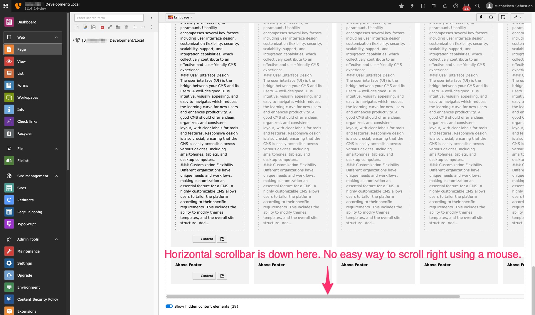
Our editors have the exact same problem, but with the page module displaying content for all languages.

 Updated by Sybille Peters 8 months ago
- Subject changed from Usability problem in listing of references: content (including action buttons) is cut off in table to Usability problem in listing of references: content (including action buttons) is not visible, have to scroll down to see scrollbar
 Updated by Sybille Peters 8 months ago
- Related to Bug #103059: Not possible to see references if no access to content where files are referenced in filelist added
 Updated by Ayke Halder 8 months ago
Sebastian Michaelsen wrote in #note-2:
Our editors have the exact same problem, but with the page module displaying content for all languages.
"Horizontal scrollbar is down here. No easy way to scroll right using a mouse."
The easy way for horizontal scrolling (left/right scrolling) is to press and hold [Shift] and then use the mouse scrolling wheel.
 Updated by Sybille Peters 8 months ago
- Description updated (diff)
Thanks Ayke. Do you think we should keep this issue open then? "Knowing how to scroll" would solve the problem, but you still have to know that there are action buttons. Also, it is inconsistent: in the redirects module you can also edit by clicking in the "Source Path" column, in the references list you can only edit with the action button (checked this in v13).
I have updated the description.
 Updated by Markus Friedrich 8 months ago
As mentioned by Sebastian this issue also exists in page module especially when using the language comparison. One of our customers already alerted us about this scrolling behaviour recently and expressed strong concerns. The workaround with shift-scroll does not work for our customer at this point and he is concerned that his editors will be seriously hindered.
I would vote for not closing this issue.
 Updated by Mathias Brodala 8 months ago
- Subject changed from Usability problem in listing of references: content (including action buttons) is not visible, have to scroll down to see scrollbar to Usability problem in listings: horizontal scrollbar not visible initially
 Updated by Riccardo De Contardi 8 months ago
Horizontal scrolling is one of the most hated interactions for the users :)
I'd suggest to avoid it whenever it is possible using text-overflow:ellipsis or word-break:break-word for example...
What to do when it can't be avoided? I think the better thing to do is to include visual hints that suggest the users that the view can be scrolled and there are further things to see.
Altassian does this on its design system using a special case of "elevation" (that is: a shadow)
https://atlassian.design/foundations/elevation/#overflow
 Updated by Sybille Peters 8 months ago
Another aspect I find important is to unify this behaviour across various lists (unless it absolutely doesn't make sense for some reason and you need a special behaviour). I already mentioned some variations between redirects module and reference list.
Also, for example in linkvalidator, this was changed some years ago (not by me) to a table with fixed column width so it does not scroll.
For a screen size with width < something, brofix (linkvalidators sister) breaks into a card layout where the columns are broken into individual rows. So, even a table is usable on small screens.
Multiple languages in page layout are another story, would be good to look at the workflow - do you even want all of them side-by-side? Not sure if that makes sense - maybe something else is needed.
Am no usability expert myself - ideally get the UX group involved.
 Updated by Ayke Halder 8 months ago
· Edited
See https://forge.typo3.org/issues/99424#note-3
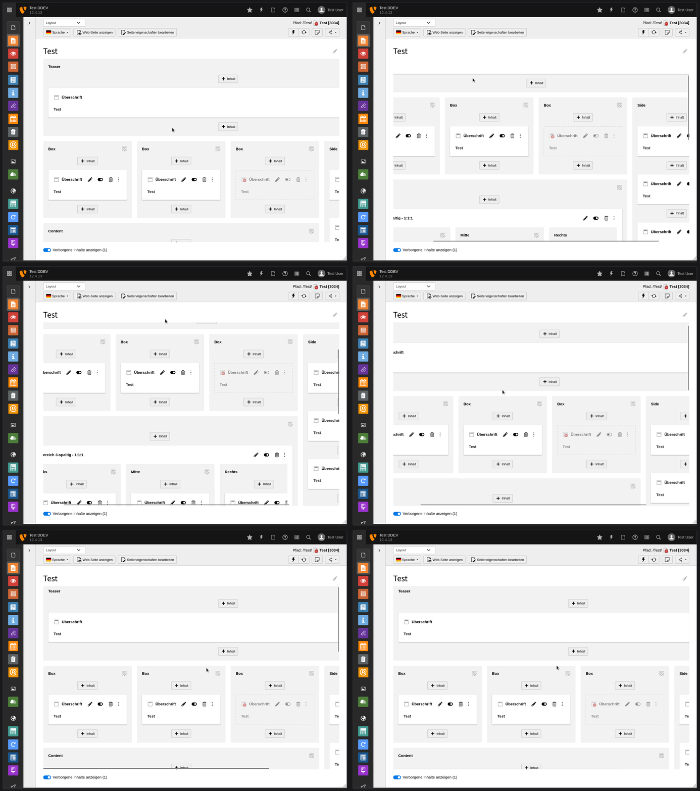
POC: scrollbars always visible inside viewport

/* grid-container scrolling behaviour */
.module[data-module-name="web_layout"] {
  display: flex;
  flex-direction: column;
}
.module[data-module-name="web_layout"] > * {
  flex: 0 0 auto;
}
.module[data-module-name="web_layout"] > .module-body {
  flex: 0 1 auto;
  overflow: hidden;
}

.module[data-module-name="web_layout"] .module-body {
  display: flex;
  flex-direction: column;
}
.module[data-module-name="web_layout"] .module-body > * {
  flex: 0 0 auto;
}
.module[data-module-name="web_layout"] .module-body > #PageLayoutController {
  flex: 0 1 auto;
  overflow: hidden;
}

.module[data-module-name="web_layout"] #PageLayoutController {
  display: flex;
  flex-direction: column;

  margin-left: calc((1px + var(--pagemodule-grid-spacing)) * -1);
  margin-right: calc((1px + var(--pagemodule-grid-spacing)) * -1);
}
.module[data-module-name="web_layout"] #PageLayoutController > .t3-grid-container {
  flex: 0 1 auto;
  /* Scrollbars stay always inside visible viewport */
  overflow: scroll;
}
 Updated by Ayke Halder 8 months ago
 Updated by Ayke Halder 8 months ago
Sybille Peters wrote:
- In some other dialogs in the BE, in addition to the action icons on the far right, you can also click on a link in the columns. This is the case in the redirects module, for example. You can edit by clicking on source_path column. I do not find this intuitive, but in cases like these it would be helpful
Actually in most places you can click on the 'title' column to edit the record.
This is also the case for 'Example 1: Listing of references'.
 Updated by Ayke Halder 8 months ago
Another edge case:
The checkbox and action icon are not visible anymore if the table columns are to wide and the table is scrolled horizontally.
Can be fixed by making the checkbox and icon sticky:
![]()
 Updated by Sybille Peters 8 months ago
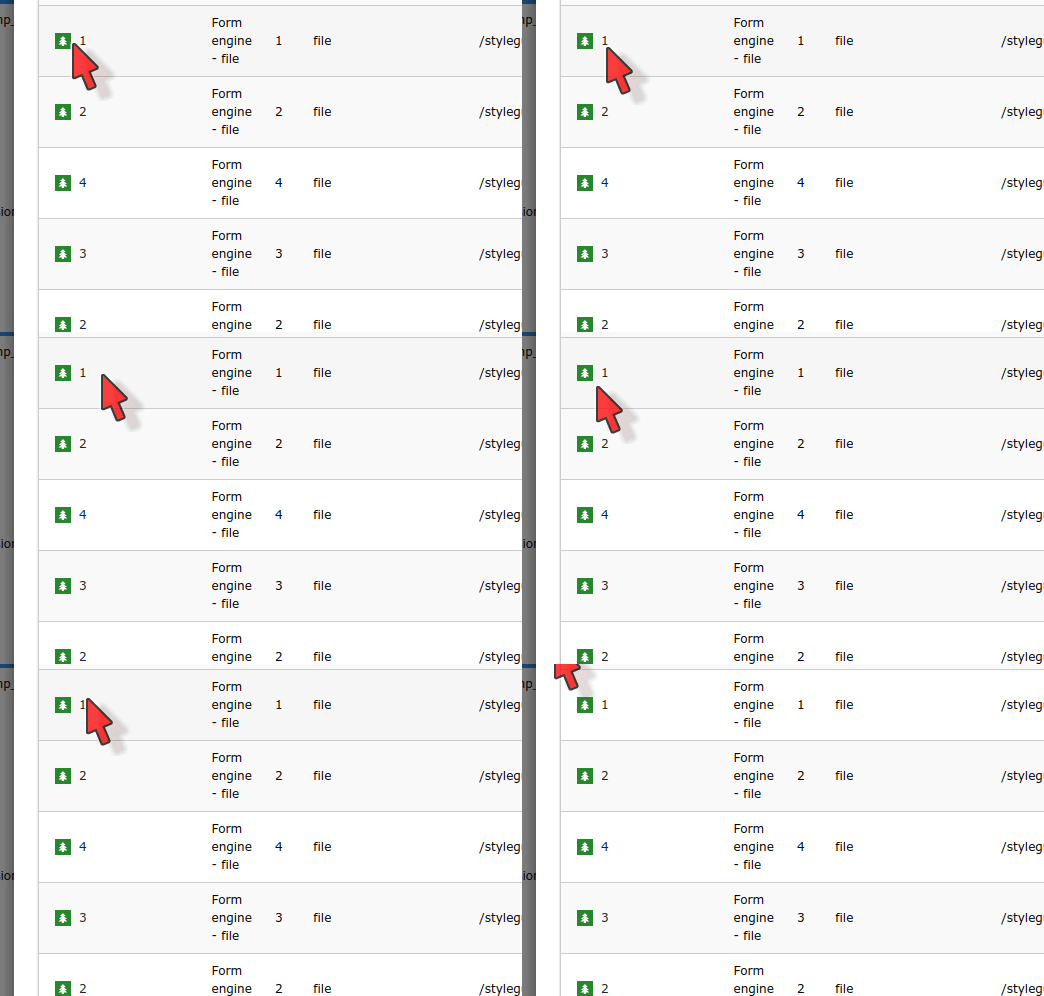
- File link_hover.gif link_hover.gif added
Actually in most places you can click on the 'title' column to edit the record.
This is also the case for 'Example 1: Listing of references'.
My bad. I did hover, just not on the title. (also the icon is clickable). I will correct my text above.
I find it not really helpful that links are - by default - not visibly styled in any way that make them discernible as links (e.g. with underline), only on hover.
Also, not the entire area is marked as link but only the text itself. So you have to hover or click exactly over the text.

 Updated by Ayke Halder 8 months ago
- Description updated (diff)
Sybille Peters wrote in #note-16:
I did hover, just not on the title. (also the icon is clickable). […]
I find it not really helpful that links are - by default - not visibly styled in any way that make them discernible as links (e.g. with underline), only on hover.
Also, not the entire area is marked as link but only the text itself. So you have to hover or click exactly over the text.
There is a ticket on these small icon-links which should be implemented as buttons: #103572
 Updated by Ayke Halder 8 months ago
- Related to Bug #103572: UX: Backend Page Module - content element header buttons 'icon' and 'more action menu' do not have visual feedback and click-target is too small added