Feature #52090
closedMerge Save Buttons
0%
Description
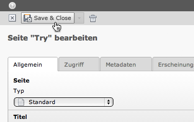
To remove visual clutter it'd be great to merge the different save buttons into a split button drop down. Suggested to the UX team, designed and approved by Jens:


The CSS for this:
Arrow:  (inactive) = small-arrow-down-8bit.png
.select-box-inactive-bg {
    border: 1px solid #b3b3b3; /* stroke */
    background-color: #cbcbcb; /* color overlay */
}
.select-box-hover-btn {
    border: 1px solid #7b7b7b;
    background-image: -moz-linear-gradient(bottom, #d5d5d5 0%, #f5f5f5 100%);
    background-image: -o-linear-gradient(bottom, #d5d5d5 0%, #f5f5f5 100%);
    background-image: -webkit-linear-gradient(bottom, #d5d5d5 0%, #f5f5f5 100%);
    background-image: linear-gradient(bottom, #d5d5d5 0%, #f5f5f5 100%);
}
Arrow:  (active) = small-arrow-down-act-8bit.png
.select-box-contextmenu-active {
    border: 1px solid #7b7b7b;
    background-color: #f7f7f7;
    -moz-box-shadow: 0 1px 4px rgba(0,0,0,.69);
    -webkit-box-shadow: 0 1px 4px rgba(0,0,0,.69);
    box-shadow: 0 1px 4px rgba(0,0,0,.69);
}
Files
 Updated by Philipp Gampe about 11 years ago
According to the UX ticket, the last state needs to be saved.
I would prefer a setting in the backend user settings for this:- last state (default=
- save
- save and close
- save preview
- save and new (save and close)
If save and new does not exists, then the button should fallback to save and close as this is the most matching behavior.
What do you thing?
 Updated by Mathias Brodala about 11 years ago
This change would also finally make at least one of those buttons usable by vastly increasing its hit area.
 Updated by Xavier Perseguers about 11 years ago
I like the idea.
UX Question: would the last option be automatically selected as default option next time?
 Updated by Ernesto Baschny almost 11 years ago
- Status changed from Accepted to On Hold
- Target version changed from 6.2.0 to 7.0
This should be tackled for future TYPO3 versions.
 Updated by Ian Solo over 10 years ago
There should be the possibility (configurable) to hide the label(s) of the button(s) or else the clutter will be nearly the same as the 4 buttons inline.
 Updated by Felix Kopp about 10 years ago
I vote for the merge by reducing down to one button: Save and close.
Save+Preview can be done after Save+Close with the preview icon in docheader of page or folder.
Also frontend editing should be used to preview.
Also Save+new can be done directly afterwards with one more click.
It will help users to return to the context focus after close to gather the thoughts and start the next step.
Any objections?
 Updated by Mathias Brodala about 10 years ago
Felix Kopp wrote:
I vote for the merge by reducing down to one button: Save and close.
Yes, at least "Save" alone doesn't serve much purpose. Actions which need saving once already (e.g. plugin selection) ask for and trigger it itself.
Save+Preview can be done after Save+Close with the preview icon in docheader of page or folder.
This strongly depends on the workflow. Some people open the page to preview in advance, some start after saving once. Thus I'd vote for keeping this one.
Also frontend editing should be used to preview.
People are used to editing in backend and viewing in frontend and I guess this will stay unless FE editing is overhauled a bit to get closer to Neos.
Also Save+new can be done directly afterwards with one more click.
It will help users to return to the context focus after close to gather the thoughts and start the next step.
I can only halfly agree with this one. Yes, the loss of context hurts the editing experience and forces you to stop and think sometimes but a huge advantage is using values of the previous record as default values for the next one (TCA useColumnsForDefaultValues). Configured correctly this can speed up record creation massively and should be kept under all circumstances.
 Updated by Mathias Schreiber almost 10 years ago
- Target version changed from 7.0 to 7.1 (Cleanup)
 Updated by Benni Mack over 9 years ago
- Target version changed from 7.1 (Cleanup) to 7.4 (Backend)
 Updated by Susanne Moog over 9 years ago
- Target version changed from 7.4 (Backend) to 7.5
 Updated by Benni Mack about 9 years ago
- Target version changed from 7.5 to 7 LTS
 Updated by Mathias Schreiber about 9 years ago
- Status changed from On Hold to Resolved
fixed with ModuleTemplate API
 Updated by Riccardo De Contardi about 7 years ago
- Status changed from Resolved to Closed